Oak Glen Camp
Identity & Wayfinding
Oak Glen isn’t just a camp. It’s a place people return to. But after 30 years, the identity didn’t reflect what the place had become.
New ownership brought a new vision, but there was no clear way to express it across the environment, the communication, or the experience of being there.
The opportunity wasn’t just to redesign a logo. It was to create a system that could carry the meaning of the place forward through the environment, navigation, and experience.
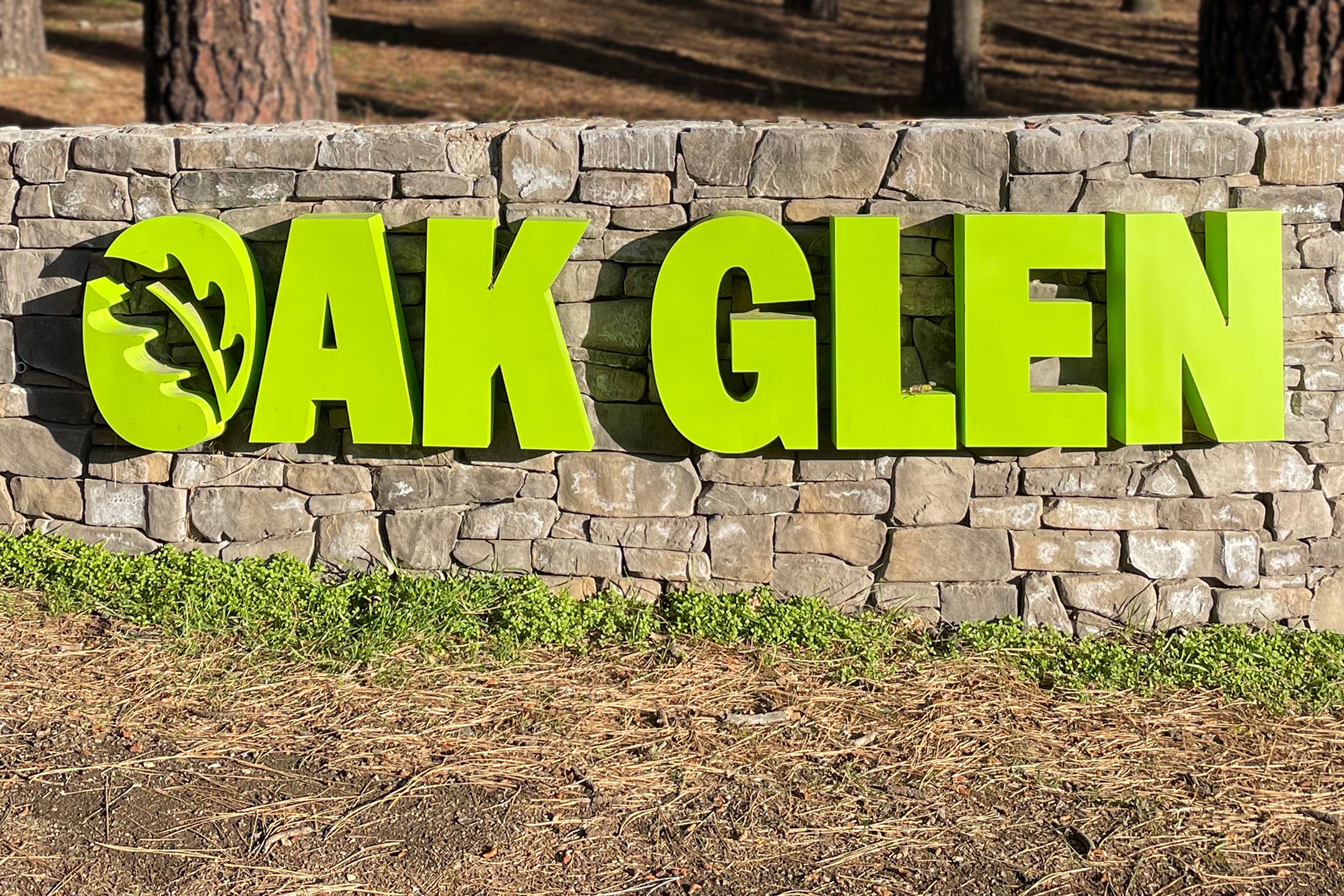
Identity Concept
The identity is built around the idea of gathering. In scripture, the oak represents a place of meeting, conversation, and presence. That idea became the foundation.
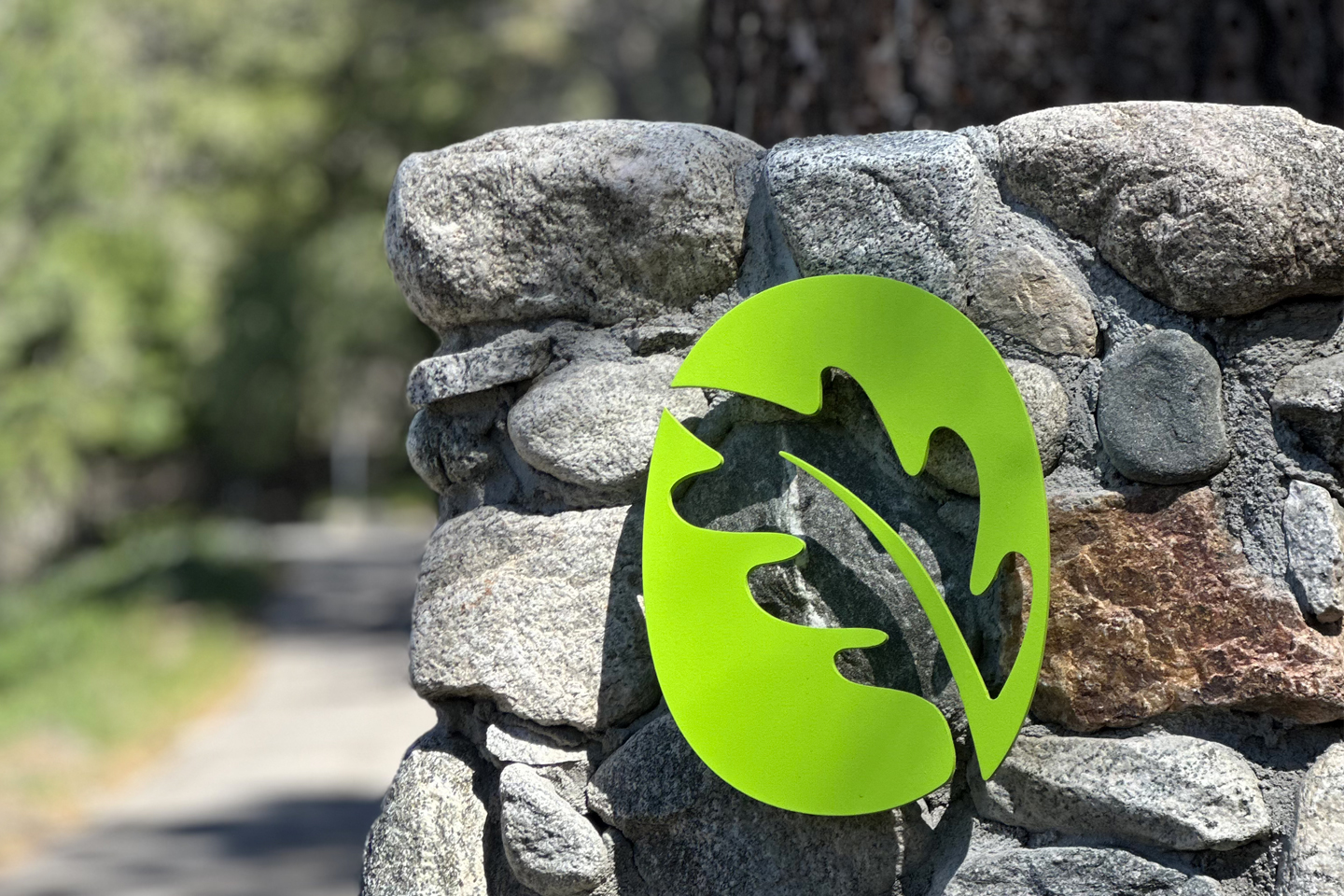
The mark centers on the letter O as both a form and a symbol. A container. A place you step into. The oak leaf sits within it, not as decoration, but as meaning.
The color palette draws from the native Southern California oaks, grounding the identity in the environment of the camp.

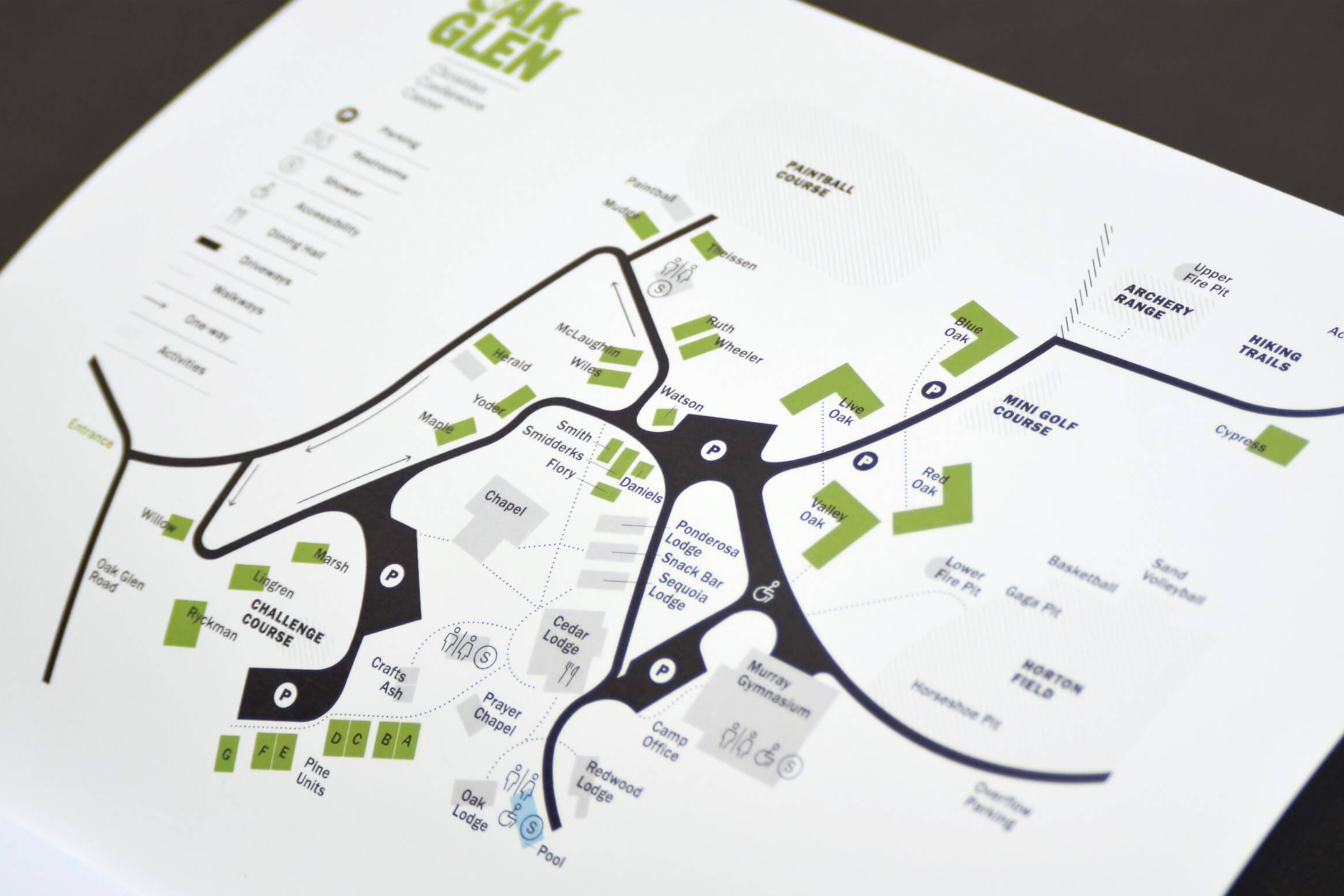
Wayfinding System
One of the biggest challenges wasn’t branding. It was navigation. The camp had grown over time, but the wayfinding hadn’t. Visitors arrived without a clear sense of where to go or how the space was organized. We approached the map as a system, not a graphic.
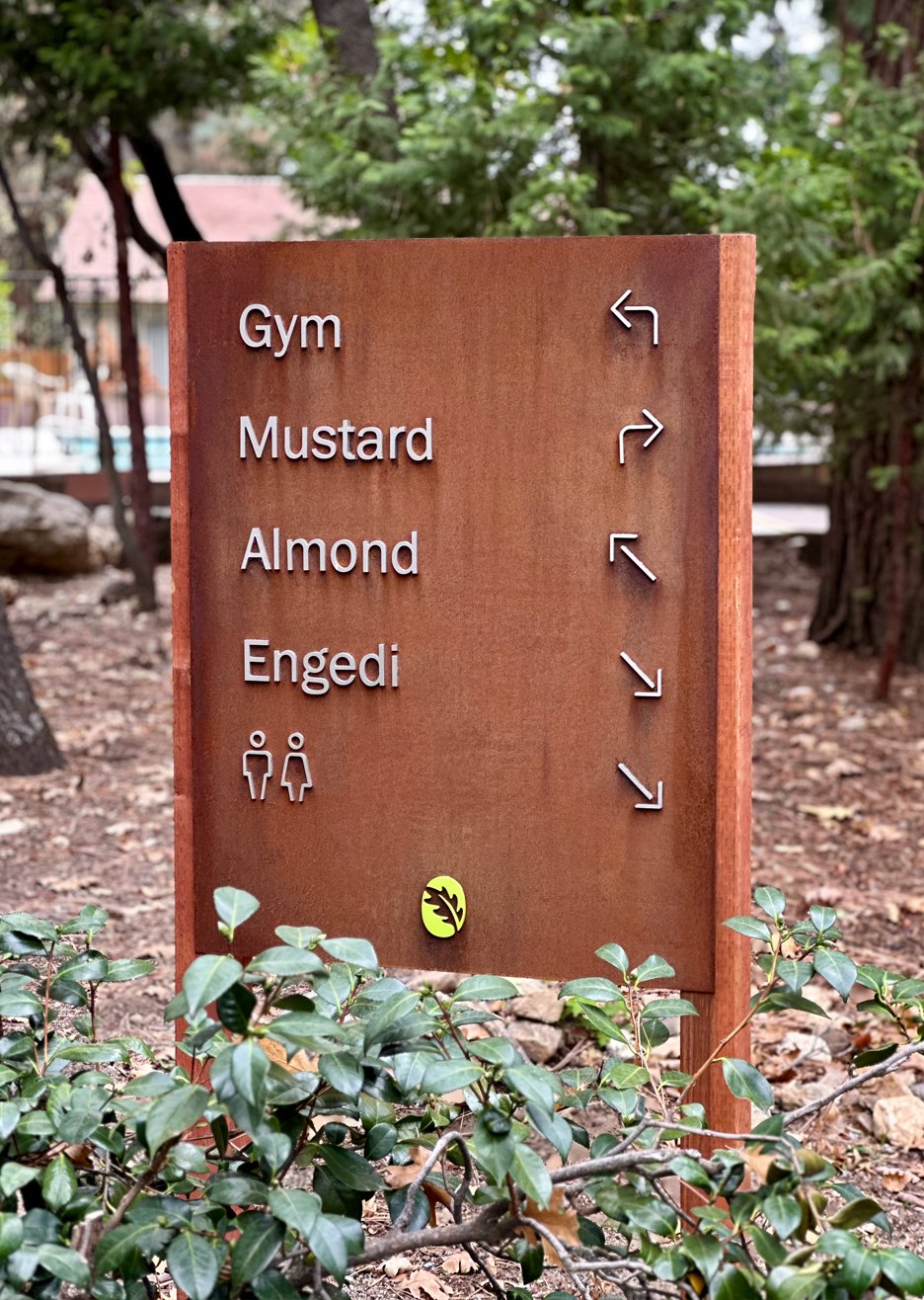
A three-tier hierarchy was developed to meet this challenge, using color, pattern, and structure:
• Primary paths and arrival points
• Buildings and gathering spaces
• Recreation and secondary areas
The goal was simple: make the experience intuitive from the moment you arrive. The result is a map and signage system that doesn’t just guide people. It orients them.
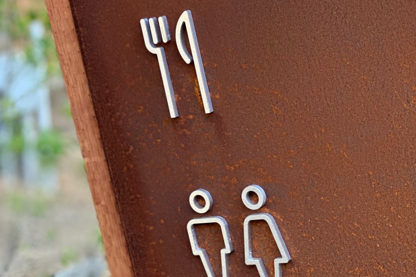
Physical Experience
The wayfinding system extends beyond the map into the physical experience of the camp. Signage was designed as a cohesive system that supports both arrival and movement, whether navigating by car or on foot.
A range of sign types work together to create clarity across different moments:
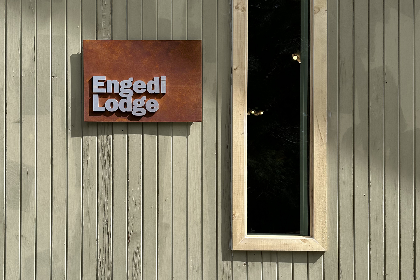
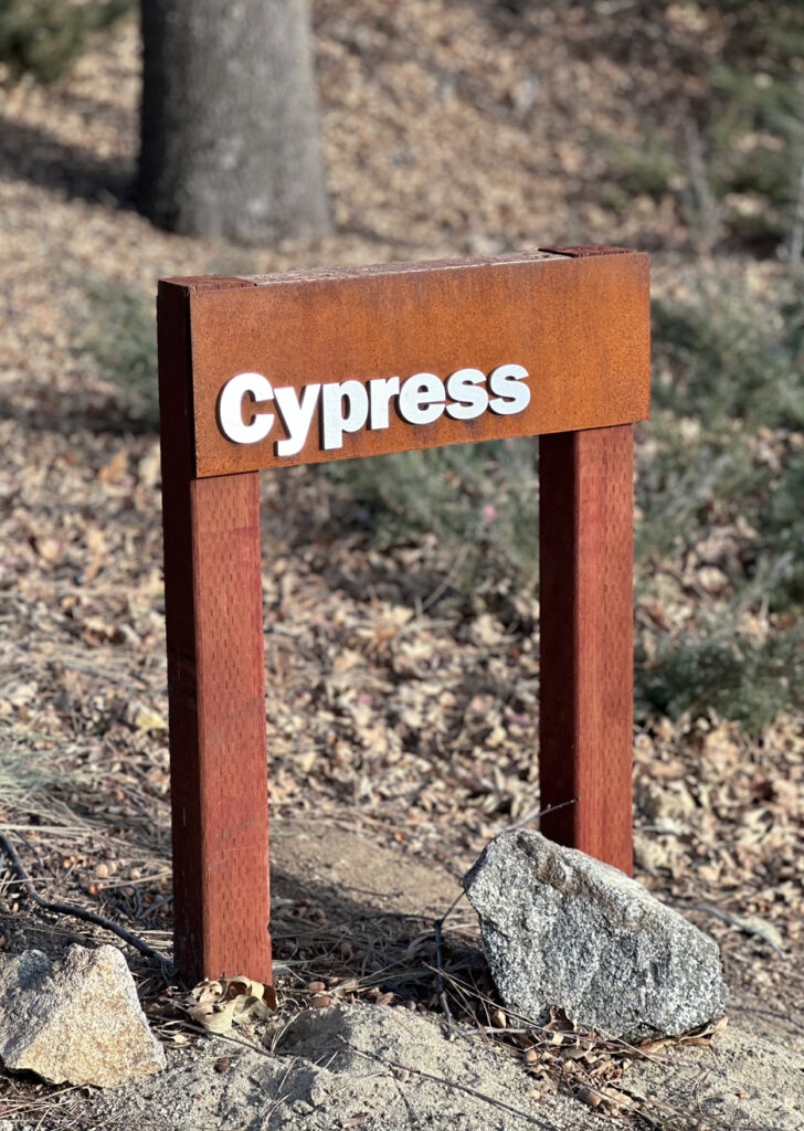
• Cabin signs identify individual spaces at a smaller scale
• Building signs mark larger gathering spaces and destinations
• Vehicle signs guide traffic and arrival points
• Pedestrian signs provide direction through the walking paths
These elements create a layered system that helps visitors intuitively understand where they are and where they’re going.
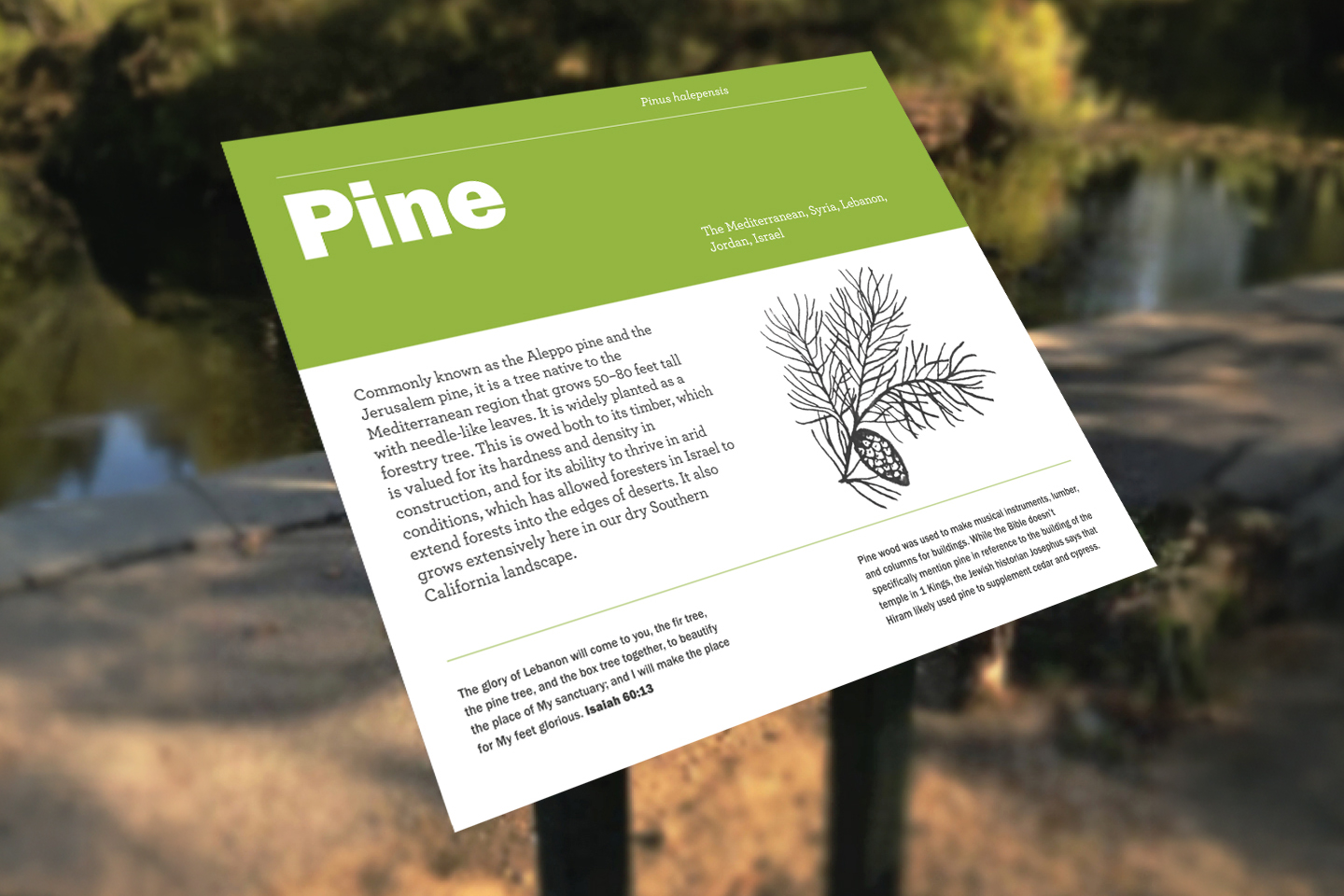
Naming Structure
In addition to the physical system, the language of the camp was redefined. A new naming structure was developed to replace a previously inconsistent system of donor-based names. The updated approach draws from biblical trees, plants, and locations, grounding the environment in a shared narrative and sense of place.
To support this system, a custom icon set was designed to bring clarity and consistency to navigation. The icons function as a visual language across maps, signage, and materials, helping users quickly recognize amenities, spaces, and directions.
Together, naming and iconography extend beyond visuals, shaping how the environment is understood and experienced.
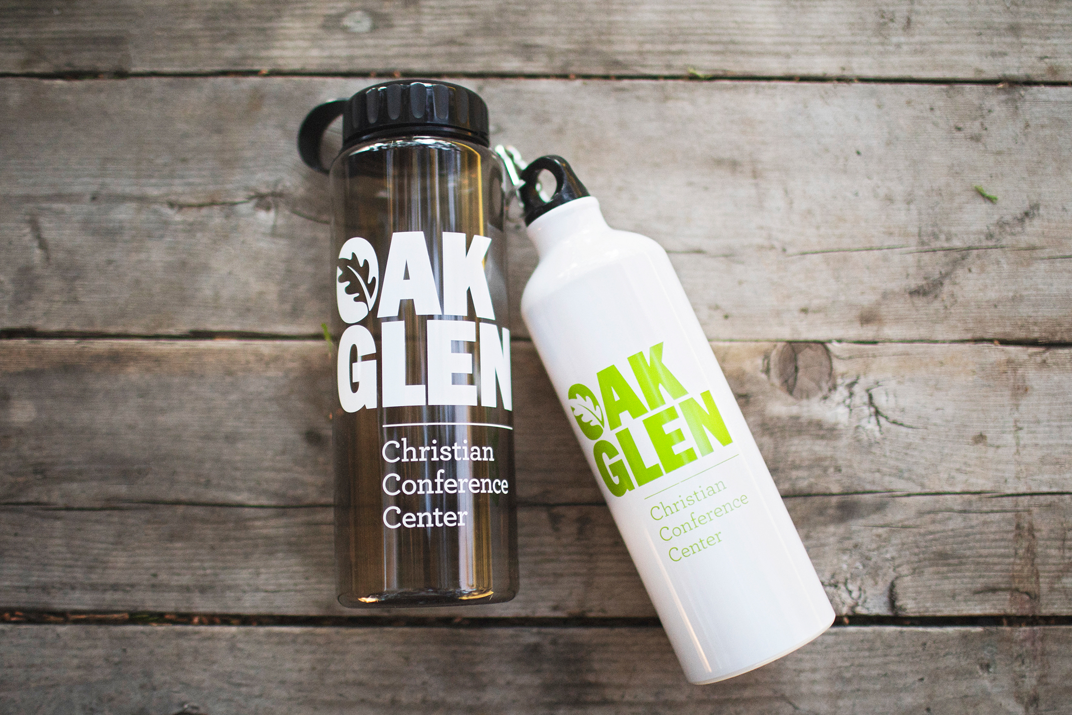
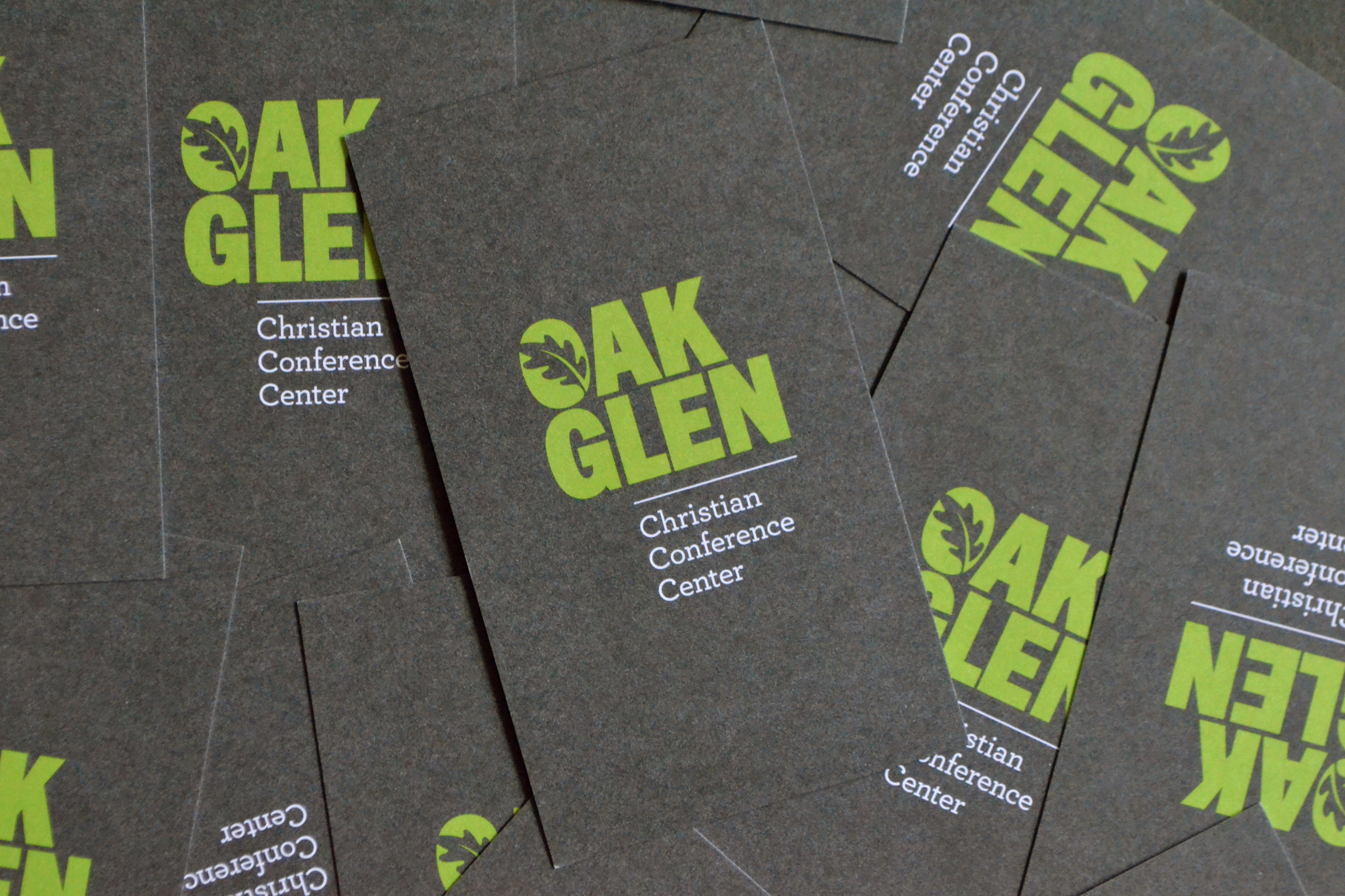
Identity In Use
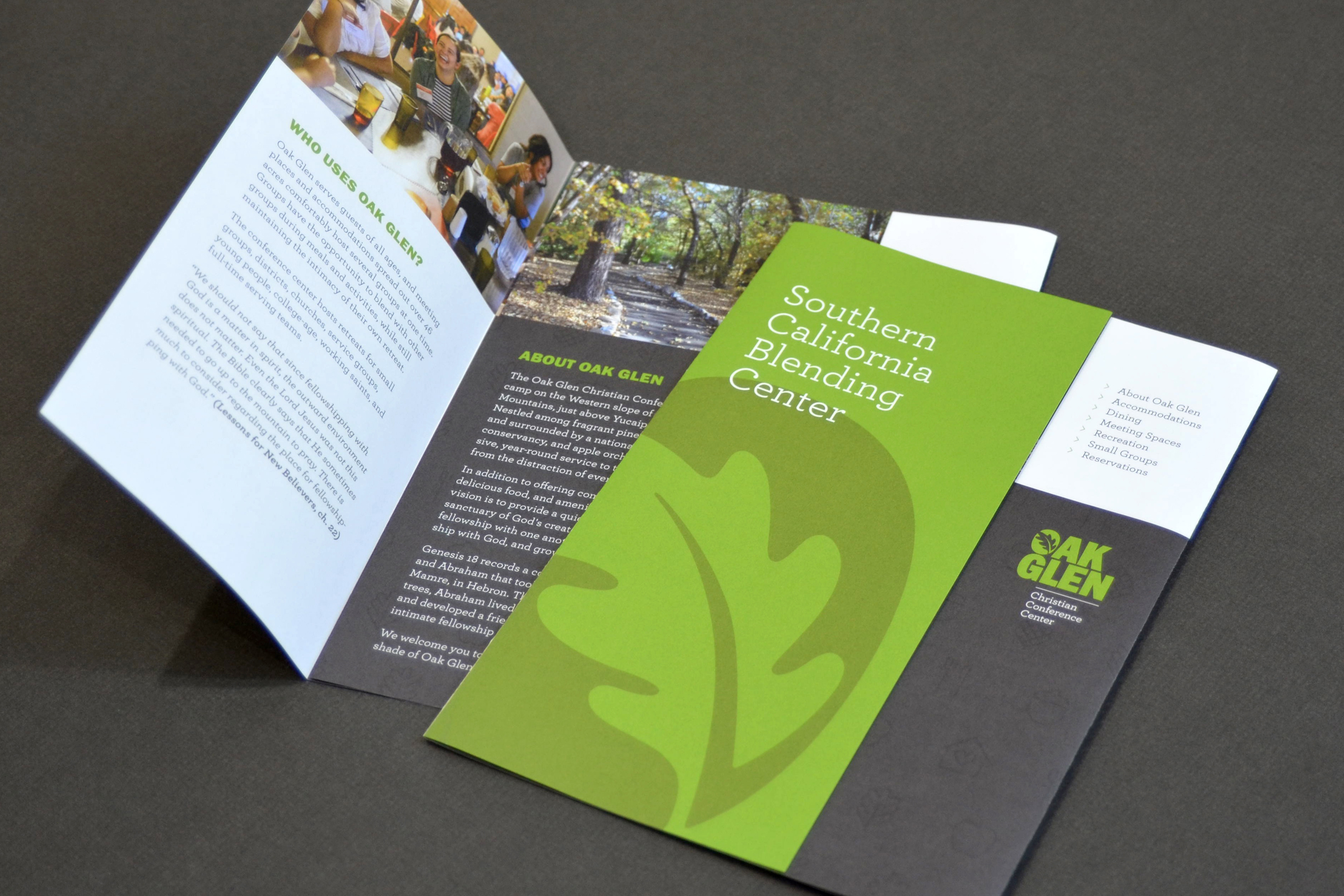
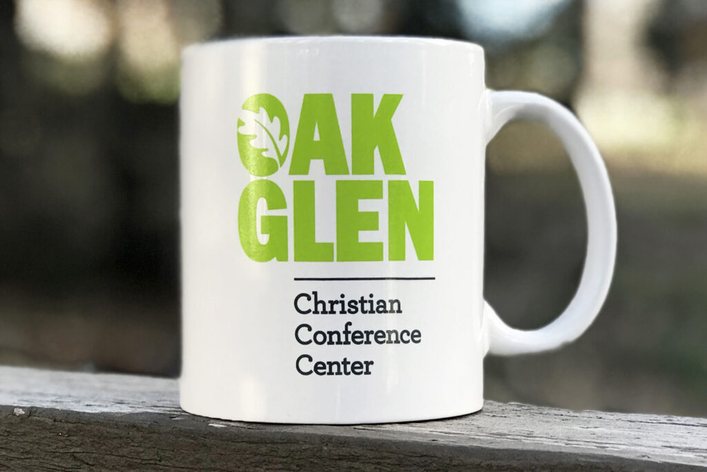
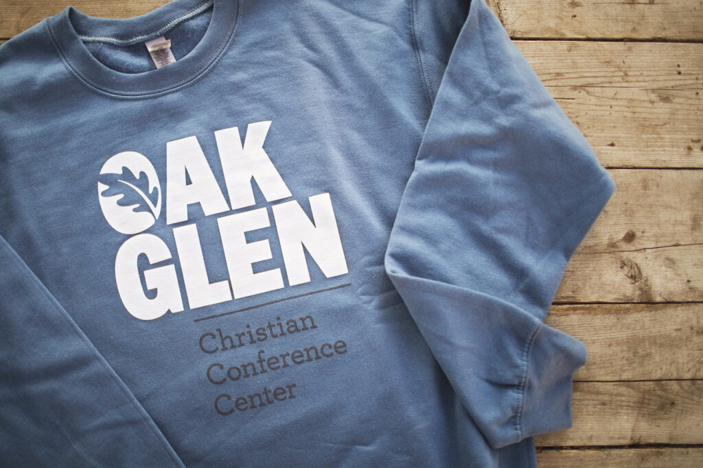
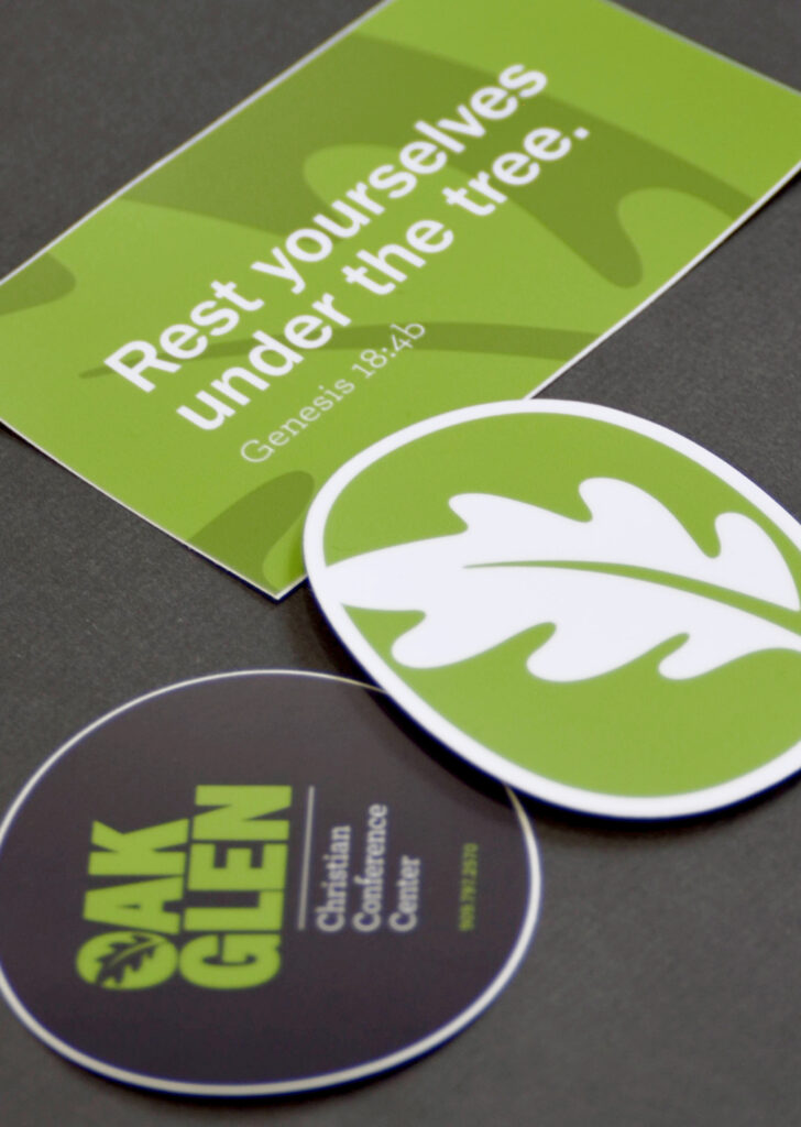
The identity carries through to printed materials and everyday use across the camp.
A brochure was developed to clearly communicate the camp’s story and offerings, giving new visitors a simple way to understand the space before arriving.
From there, the system extends into apparel, merchandise, and supporting materials. These pieces aren’t treated as separate items, but as part of the same visual language used throughout the environment.
The goal was consistency — making sure everything, from signage to something as small as a sticker or pen, feels connected to the same system.