MyLifeLab Brand Identity
MyLifeLab is a conscious education learning center focused on developing meaning-making within academics and learning agilities uniquely fit for growing children in today’s digital age.
MyLifeLab set out to be a new kind of conscious learning center that attunes themselves to each student’s unique design and facilitates their realizing of who they are and their becoming of who they are intended to be.
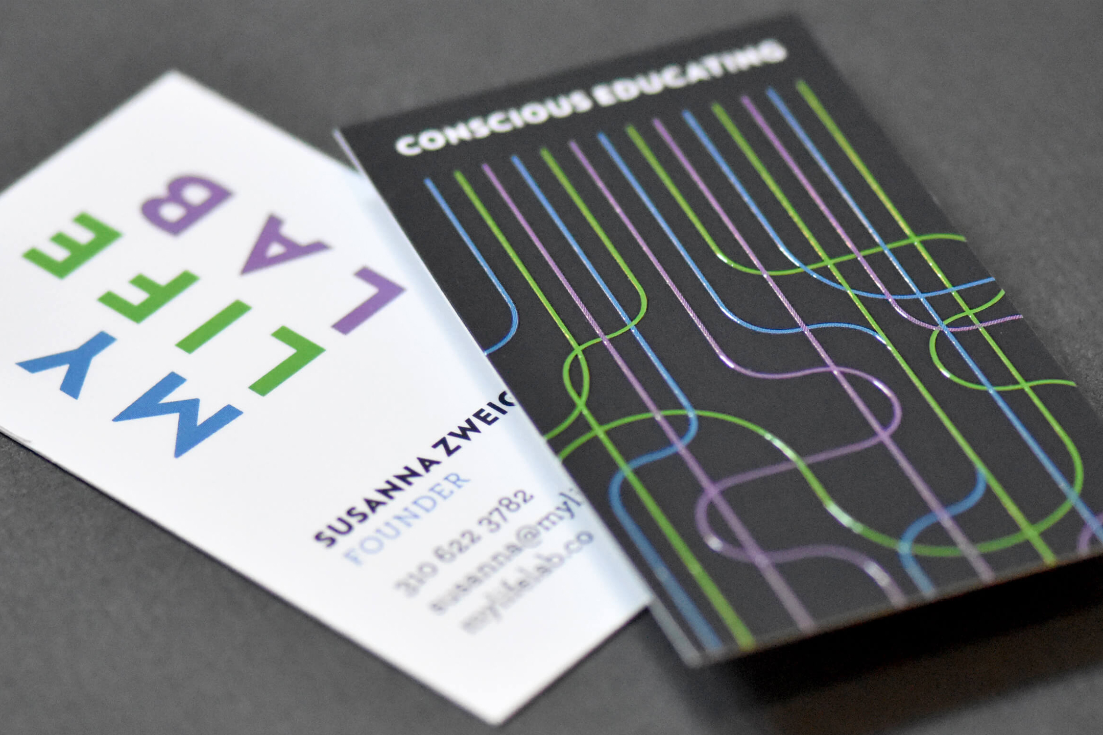
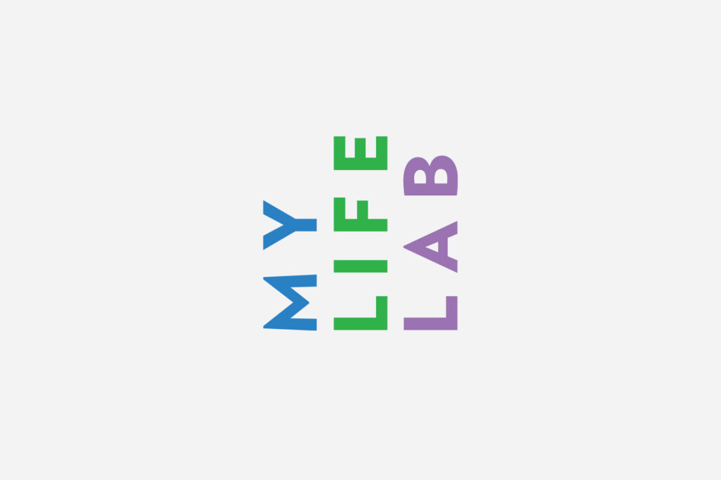
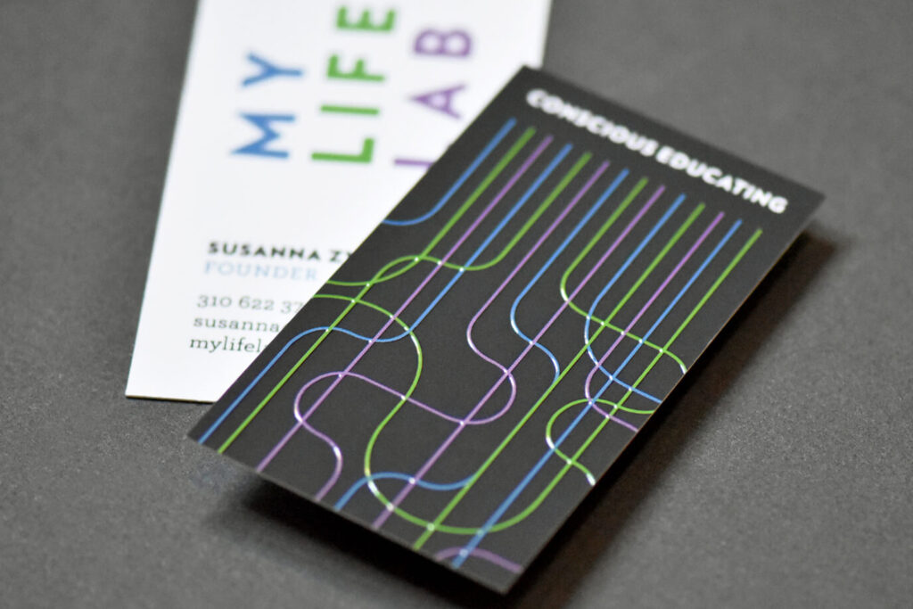
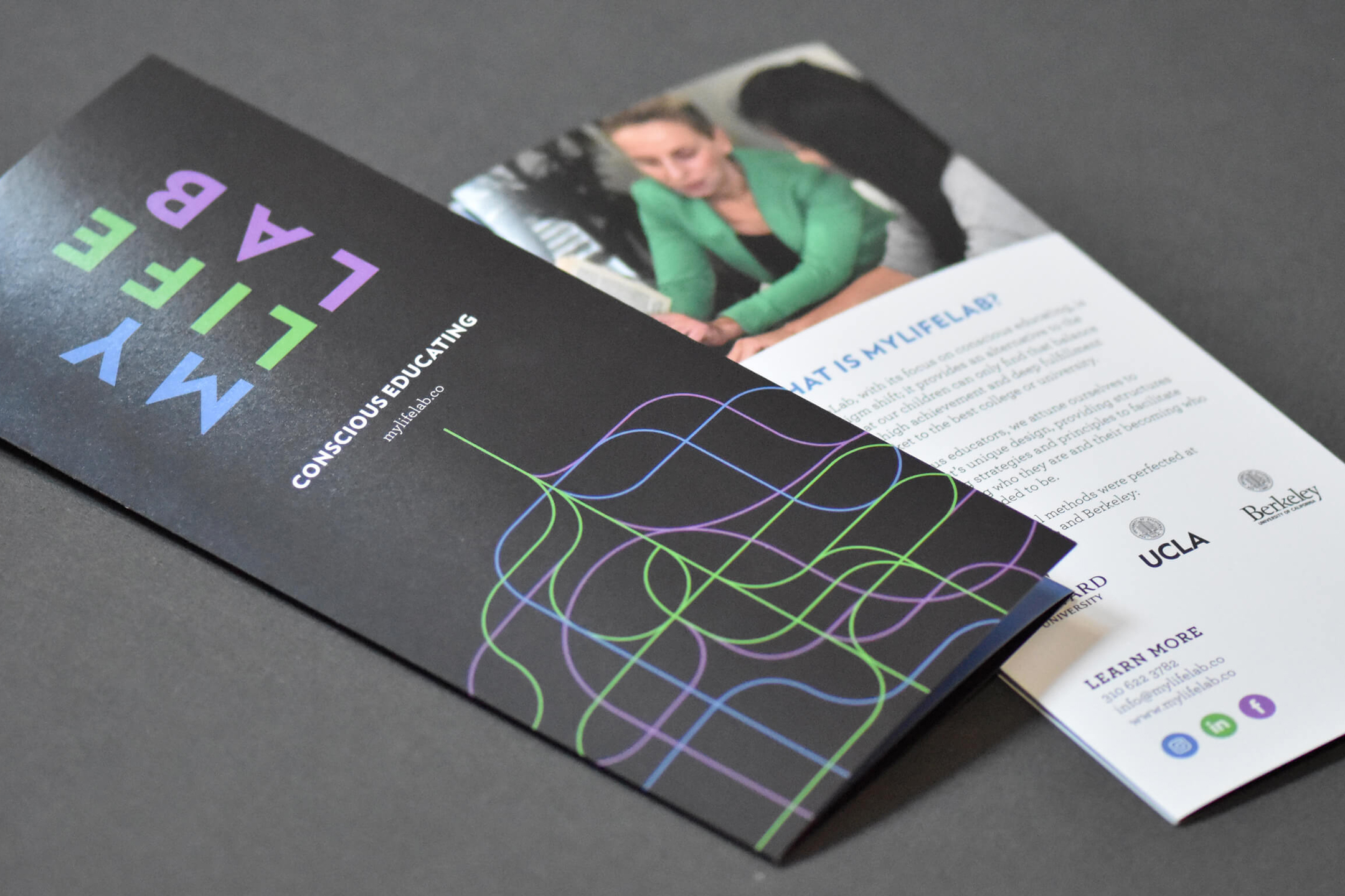
The type in the logo facing upward points to growth and positive guidance. It also represents a paradigm shift, and turning education “on its head.” Blue expresses assurance, green suggests growth, and purple, creativity.
Brand Device + Materials
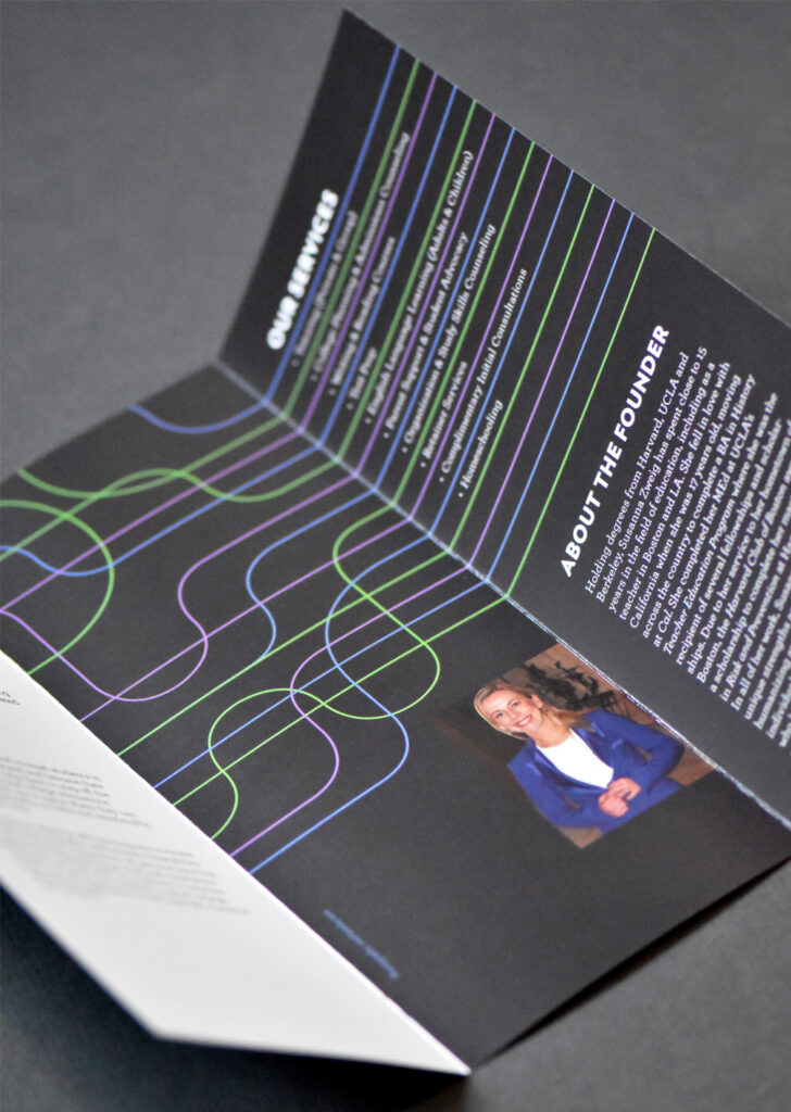
Along with the logo and identity we developed an illustrative brand device that references both the complexity of a human brain and the untangling of complicated ideas being made clear.
We also designed a suite of materials that bring the elements of the identity together, including stationery, a promotional brochure, and a social media kit.


Recognition
Shortly after the the launch of the company, the identity and printed matter were featured online at CardDsgn.com.