Corita Art Center
Brand Refresh + Guidelines
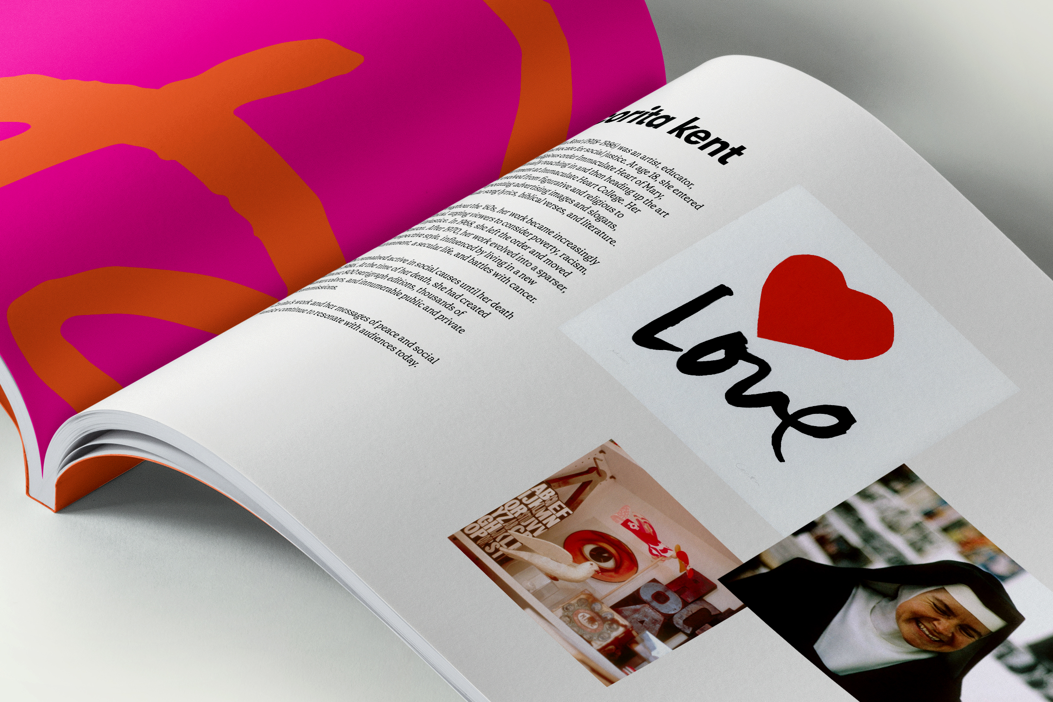
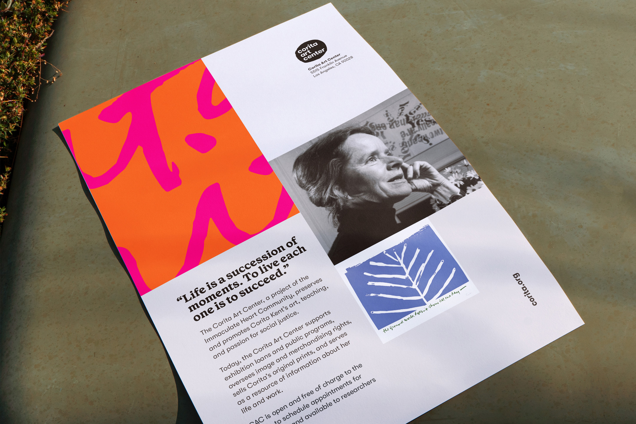
The Corita Art Center preserves and promotes Corita Kent’s art, teaching, and passion for social justice. Today, the Corita Art Center supports exhibition loans and public programs, oversees image and merchandising rights, sells Corita’s original prints, and serves as a resource of information about her life and work.
In 2016 Juliette Bellocq of Handbuilt Studio developed a visual identity for the Corita Art Center. Since then they’ve steadily grown in size and program offerings. To support that growth, Ben Loiz Studio partnered with them to clarify their brand personality and expression, refresh and build on their visual identity, and create guidelines for in-house and external use.
Visual Identity Refresh
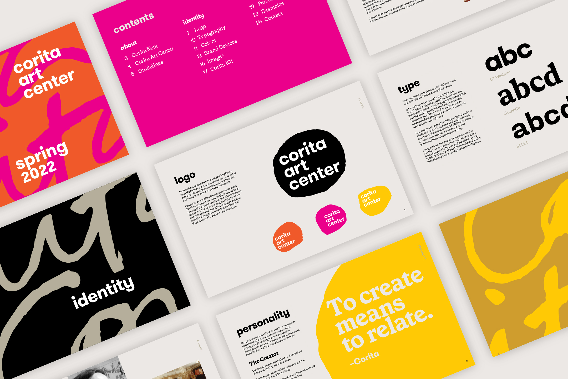
One of the goals of this partnership was to audit their graphic and verbal assets in order to refresh their visual identity. This helped us design a more robust and consistent expression, while allowing for flexibility moving forward.
Their “wonder ball” logo was refined into a more cohesive and scalable visual system, improving typography, optical balance, readability, and consistency across applications while preserving the mark’s fluid and playful character. A clearer hierarchy of primary and alternate marks was established to support both flexibility and long-term brand cohesion.
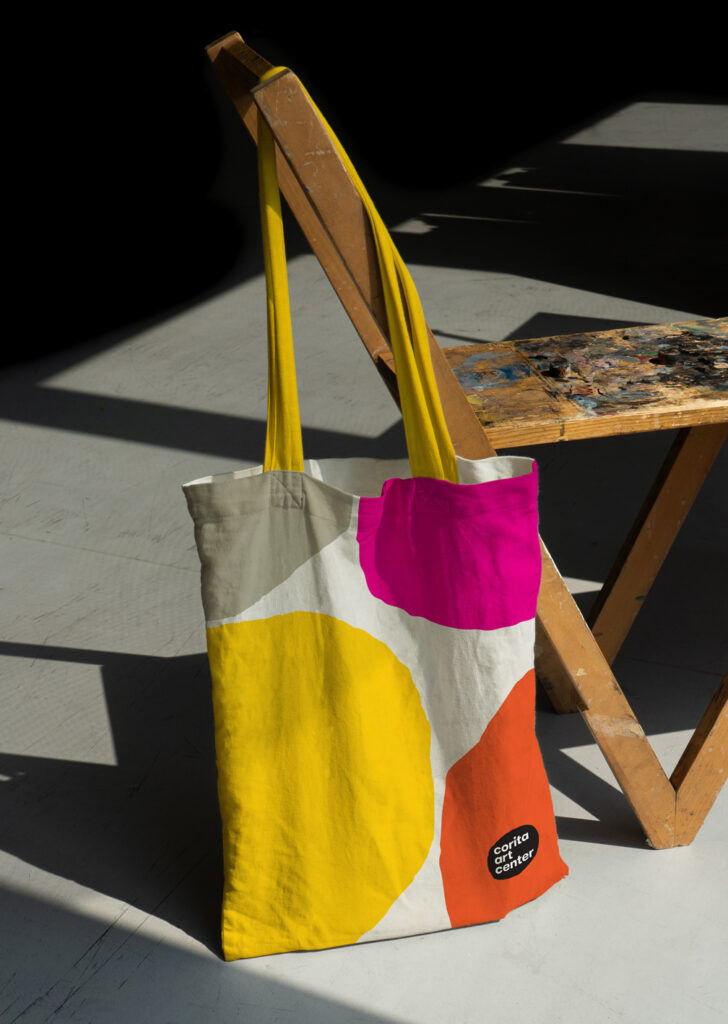
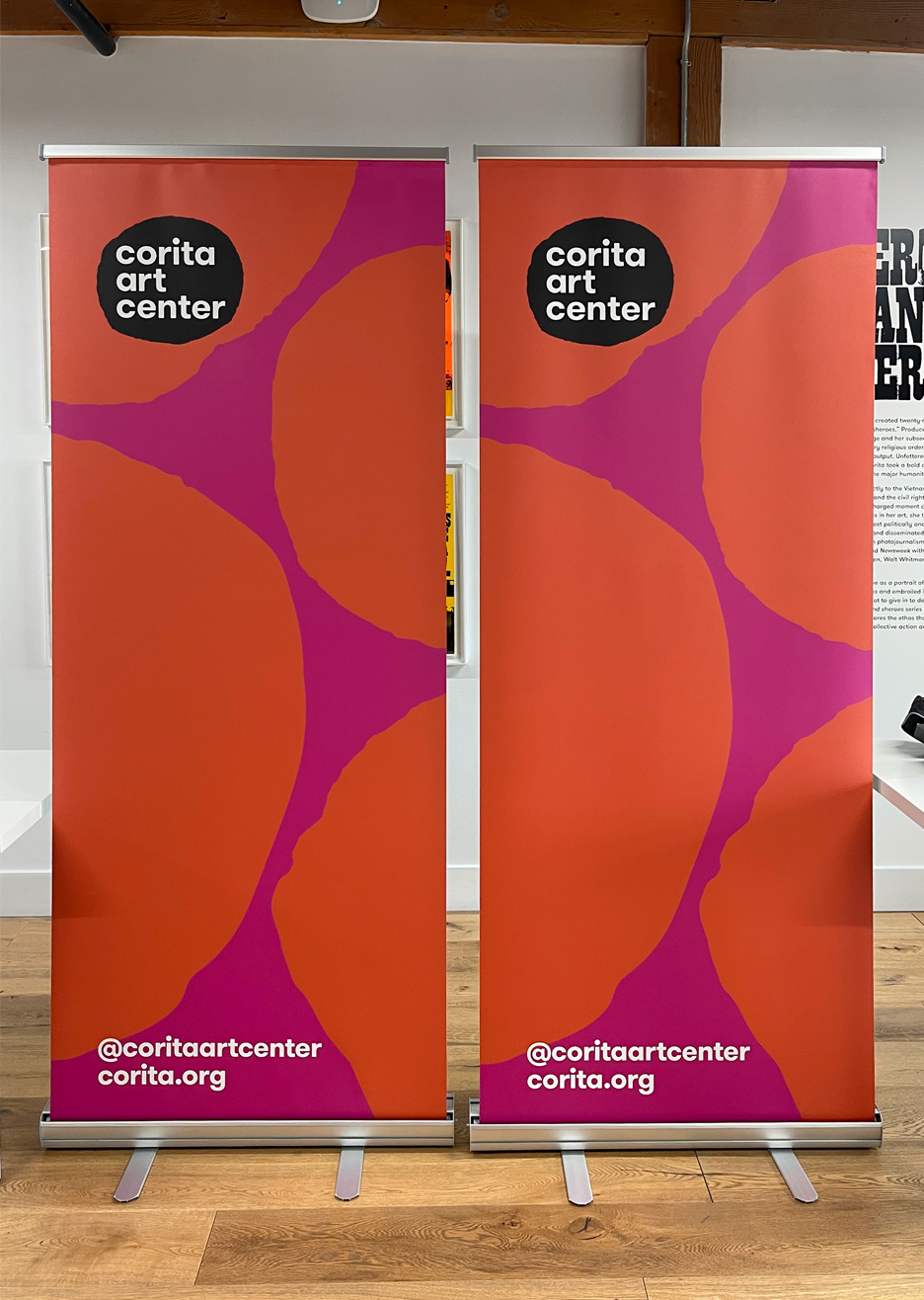
We developed a primary color palette of bold hues pulled from Corita’s work, along with an expanded set of additional colors for monochromatic applications and vibrant complementary combinations. CAC’s typographic toolkit was also broadened beyond GT Walsheim by Grilli Type to include Grenette by Colophon Foundry and Nitti by Bold Monday.
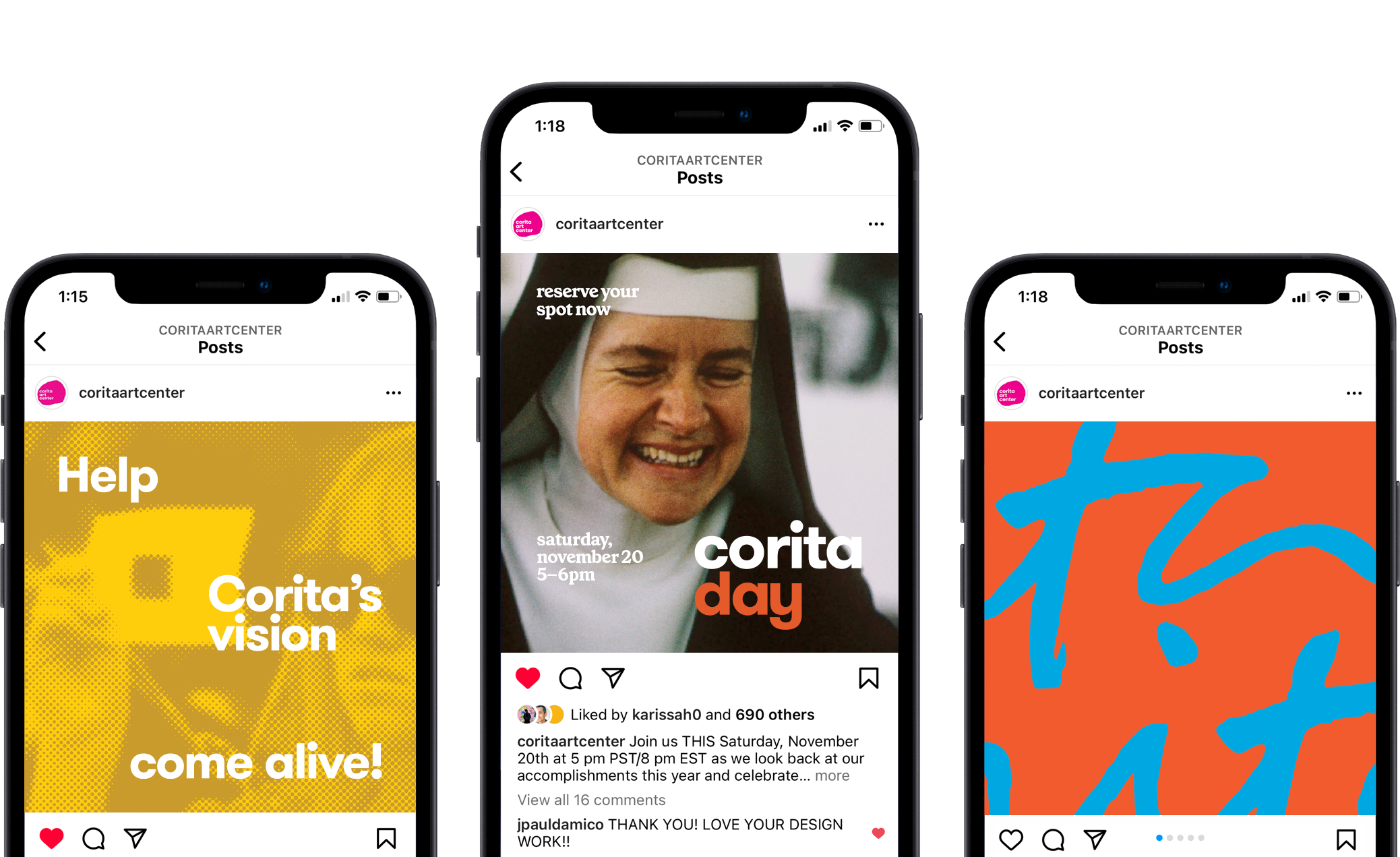
Social Media
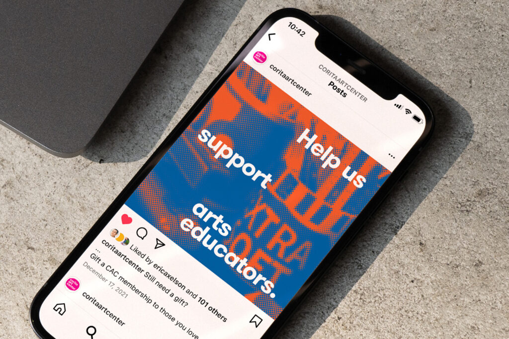
We worked together to develop social media assets for their online communications. Various brand devices were conceived, including a nostalgic halftone pattern balanced by dynamic type layouts, a pattern made from fragments of Corita’s beloved signature, and their ongoing use of the “wonder ball” as a backdrop for quotes and sentiments.
These devices were created to support fundraising initiatives, annual membership programs, and events, as well as introduce a unified look and feel for their social media presence.
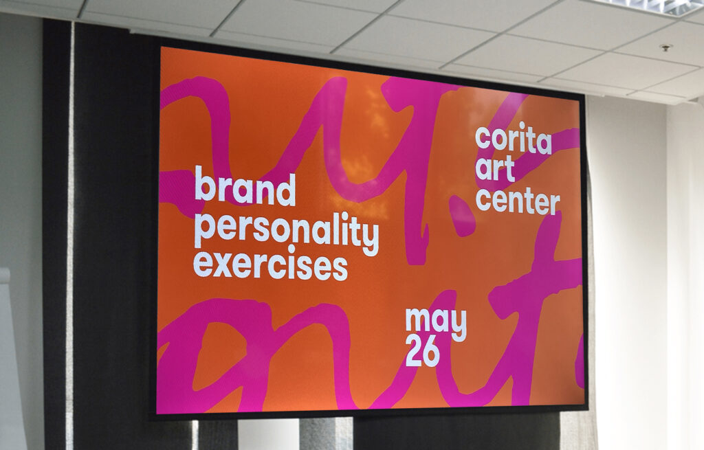
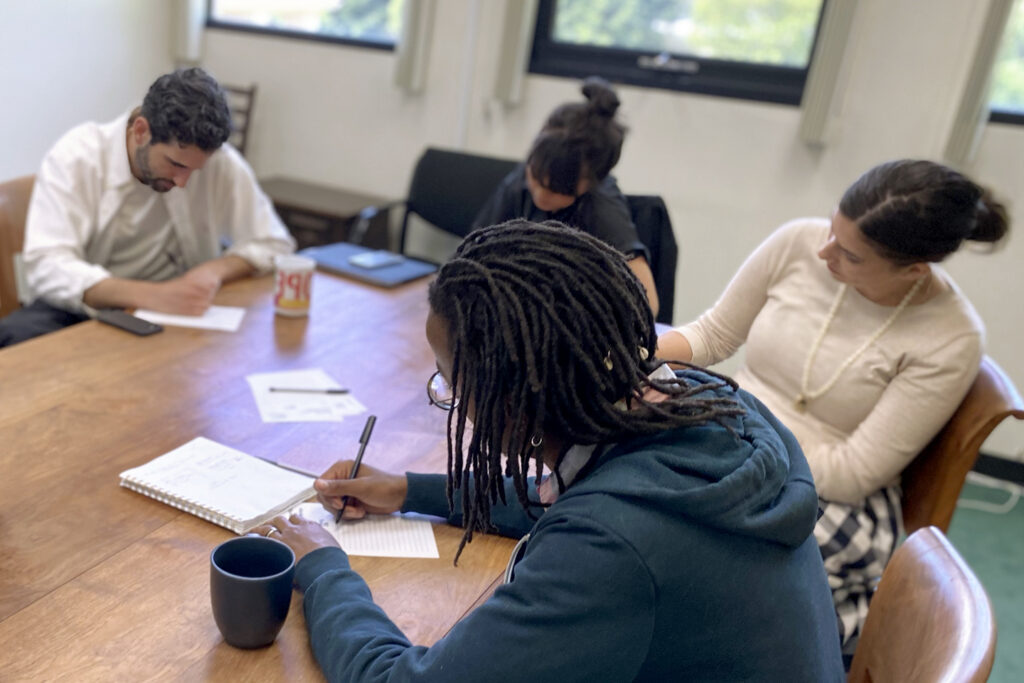
Brand Workshop +
Guidelines
A workshop was facilitated at the center to define their brand personality archetype, identify key nuances of the organization’s character, and develop a shared language reflecting their culture, programs, ethos, and collection.
These findings were translated into a 25-page brand guideline designed to support creative and production work across the organization. Used by internal teams and external collaborators, the guide provides a consistent framework for developing materials while reducing ambiguity and reinforcing a shared understanding of the brand.
As shared by the Corita Art Center team, the system “not only saves time when working with external partners, but has helped shape our identity and culture internally.”
Extended Applications
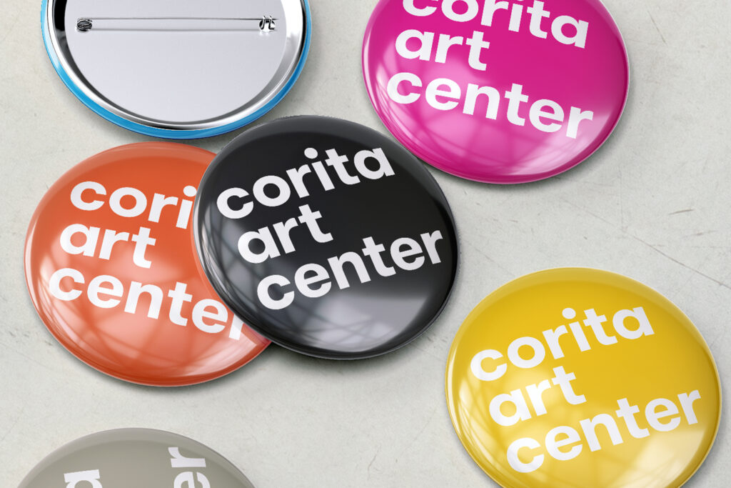
The identity system was designed to extend across a range of applications — from print and merchandise to digital touch points. These examples explore how the visual language adapts across formats while maintaining consistency in tone, typography, and color.
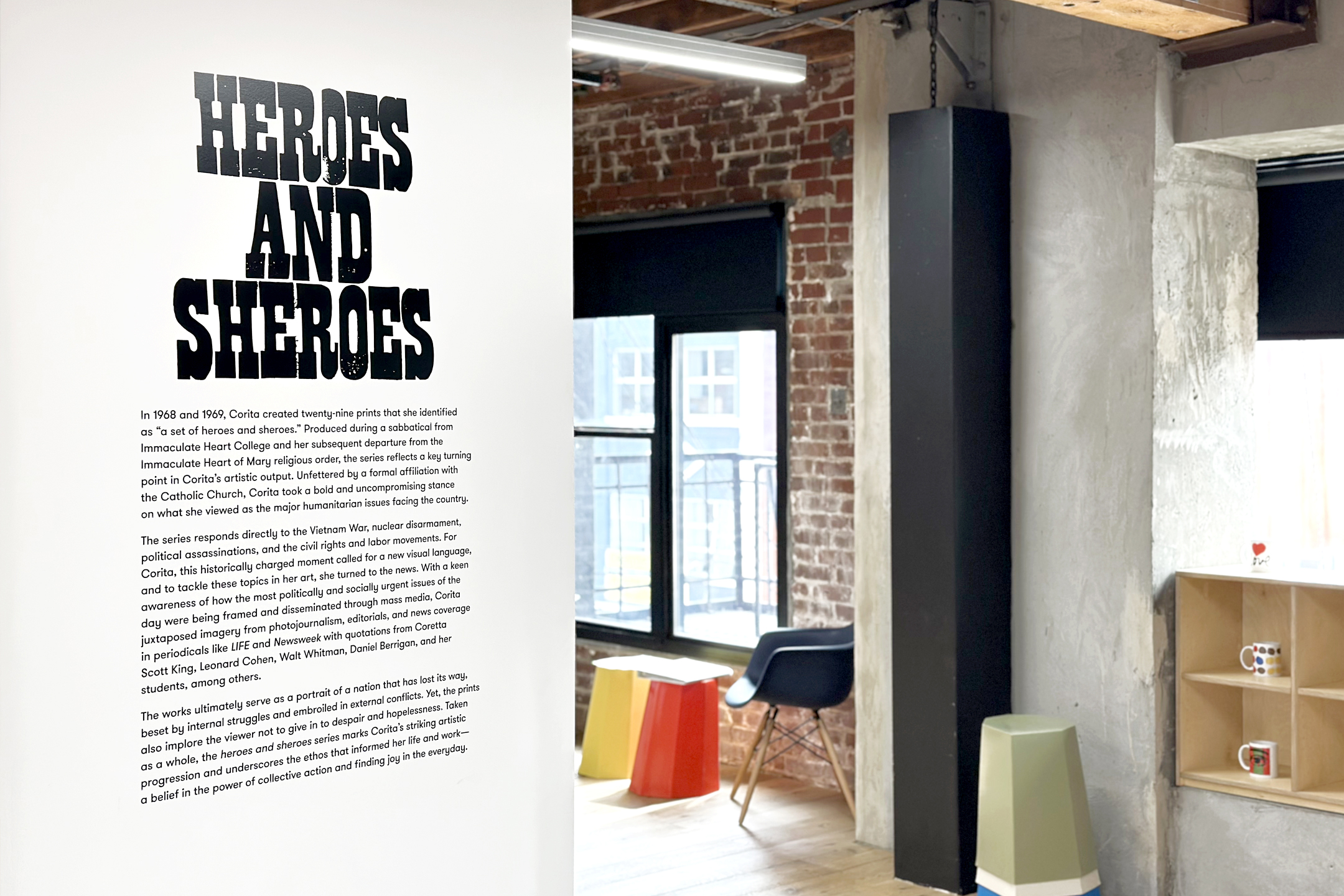
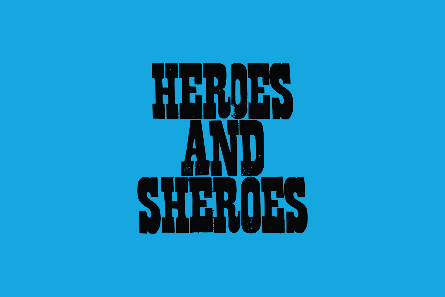
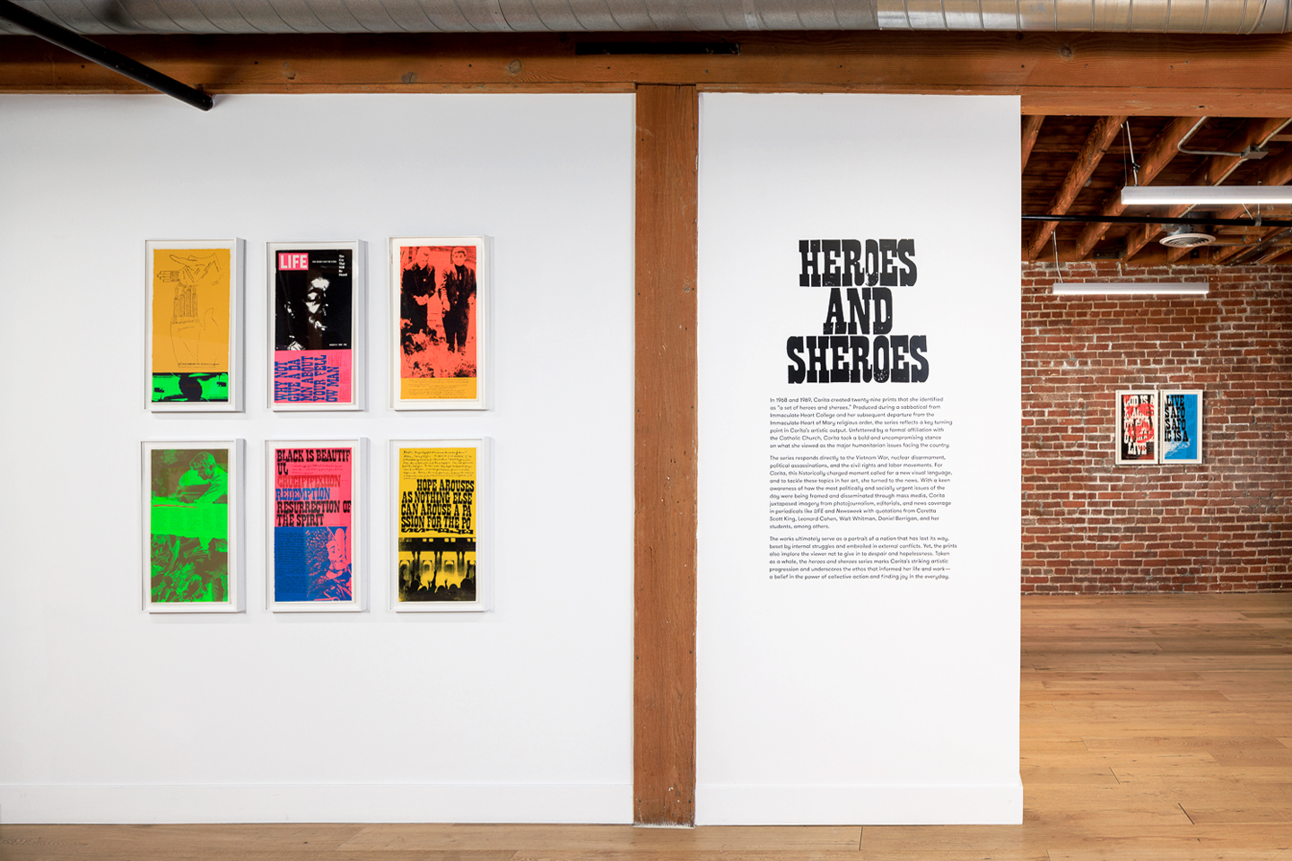
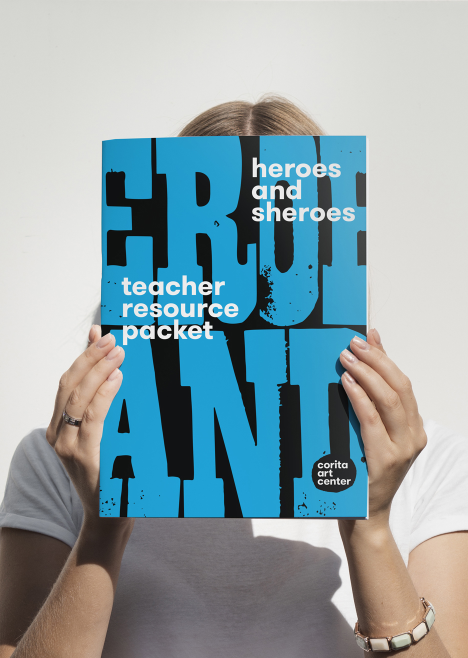
Heroes and Sheroes
Building on the identity, I developed a full system for Heroes and Sheroes, the inaugural exhibition at the center’s new gallery space, featuring Corita’s work from 1968–1969.
The visual language draws from that same energy, translating it into typography, scale, color, and composition across exhibition graphics, wall text, signage, and interpretive materials.
To support implementation as Heroes and Sheroes transitions into a traveling exhibition, I created an exhibition identity guide along with printed materials and a teacher resource guide, ensuring consistency across institutions and adapting to different environments.
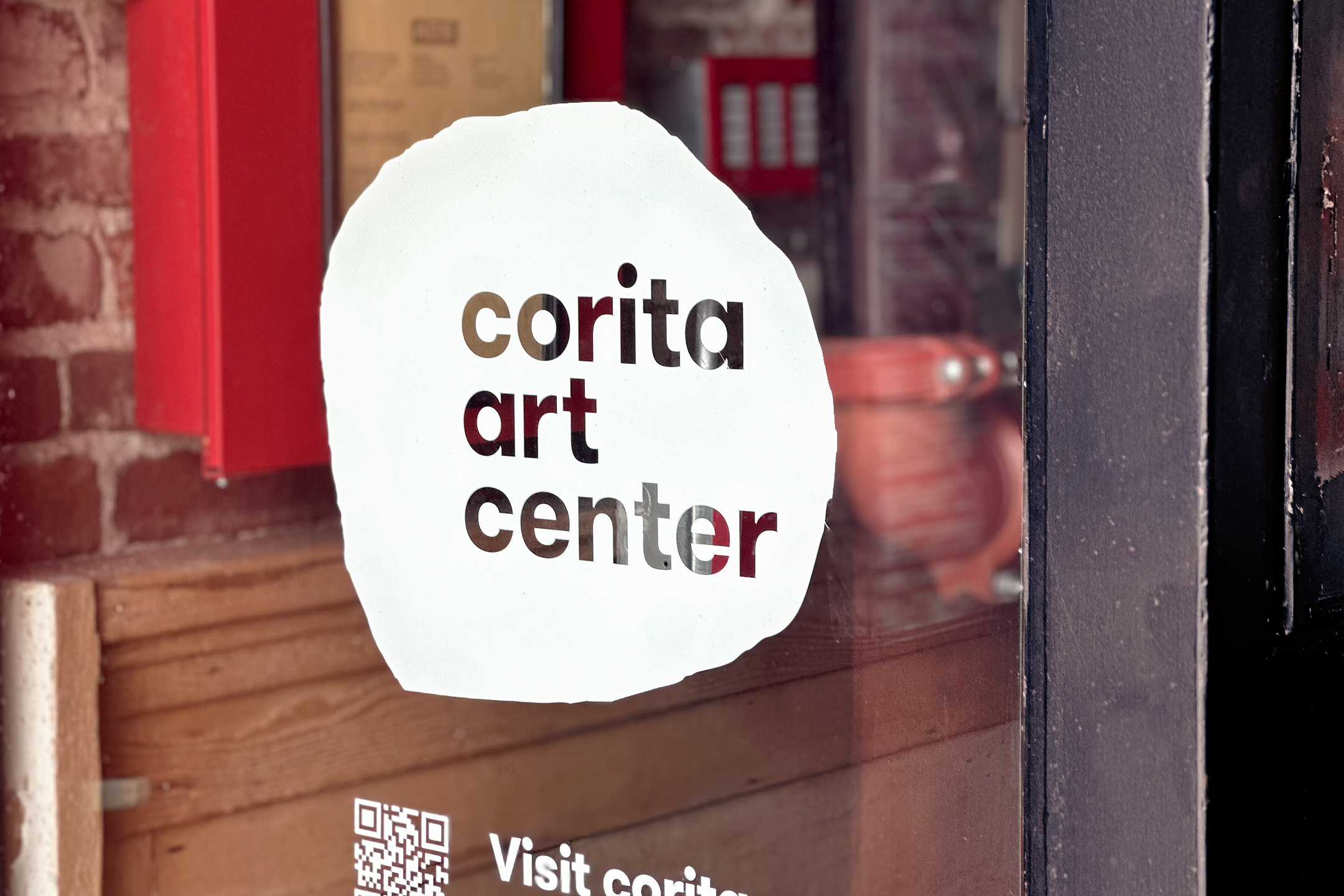
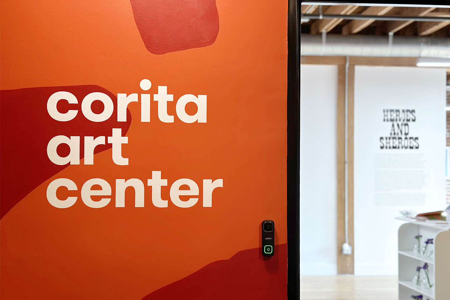
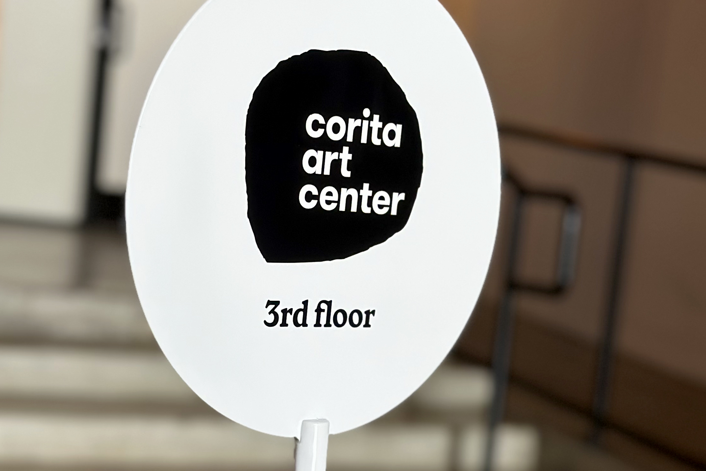
In Use
The identity is implemented across the Corita Art Center, from signage and way-finding to environmental graphics and everyday touchpoints.
Across these applications, the visual language is built from a combination of typography, color, pattern, and mark-making — each adapting to different contexts while maintaining a consistent voice.
Rather than a fixed set of outputs, the identity functions as a flexible framework, allowing the Corita Art Center team and external collaborators to build upon the system over time while maintaining consistency in voice, structure, and expression.