
Community as Therapy
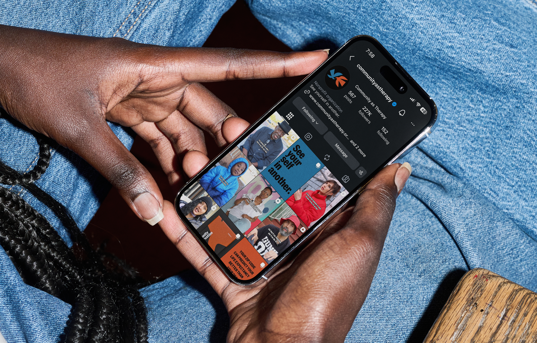
Community as Therapy is a storytelling platform founded by a practicing therapist to build empathy, understanding, and connection through lived experience. Using street interviews and conversation, the platform creates space for people to be heard beyond labels, statistics, and stigma.
As the platform grew, I was brought in to create a cohesive visual identity and scalable system that could support its social presence, storytelling, and expanding product line.
Identity System
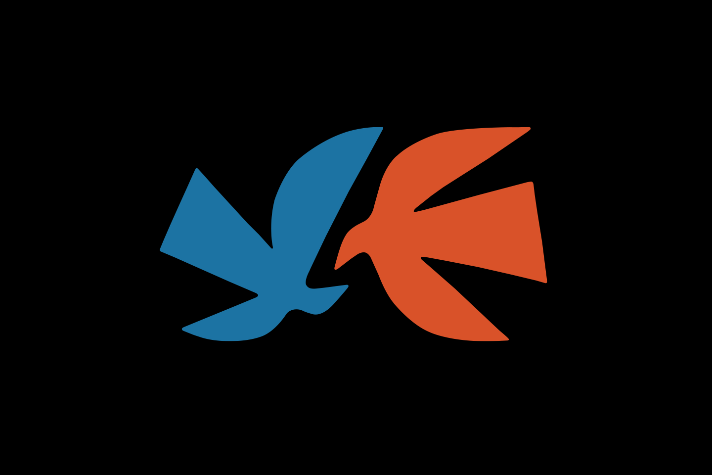
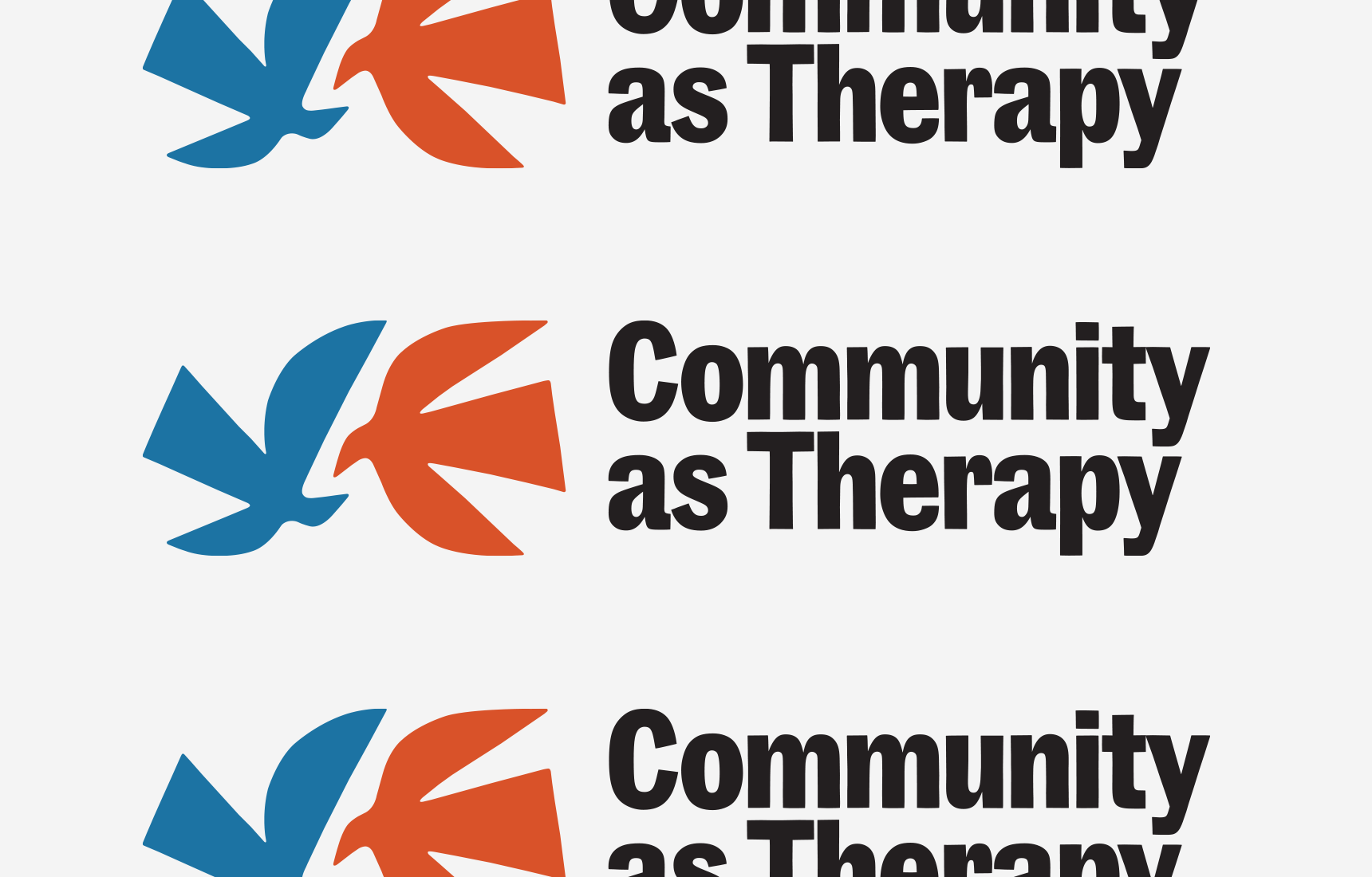
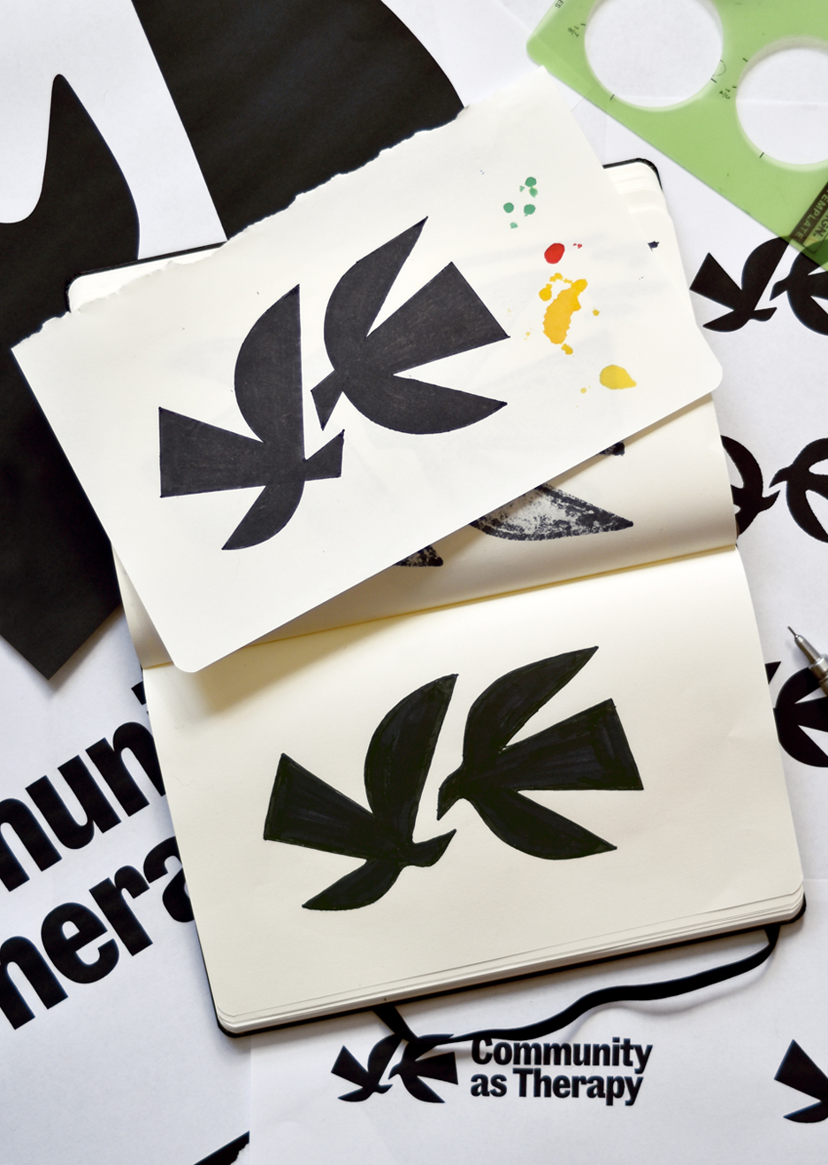
The mark is built around two forms in relationship, reflecting the idea of seeing yourself in another. The shapes are intentionally simple and expressive, balancing clarity with a more natural, human feel.
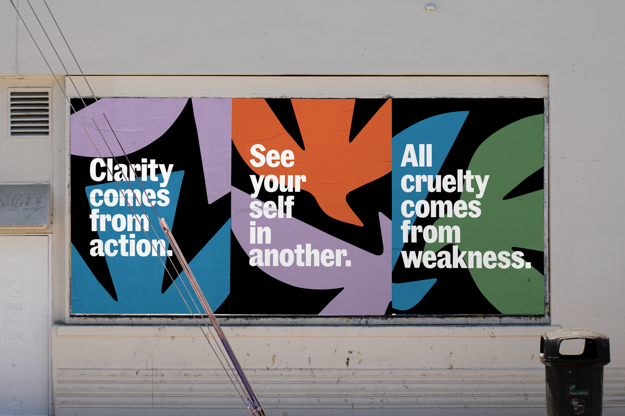
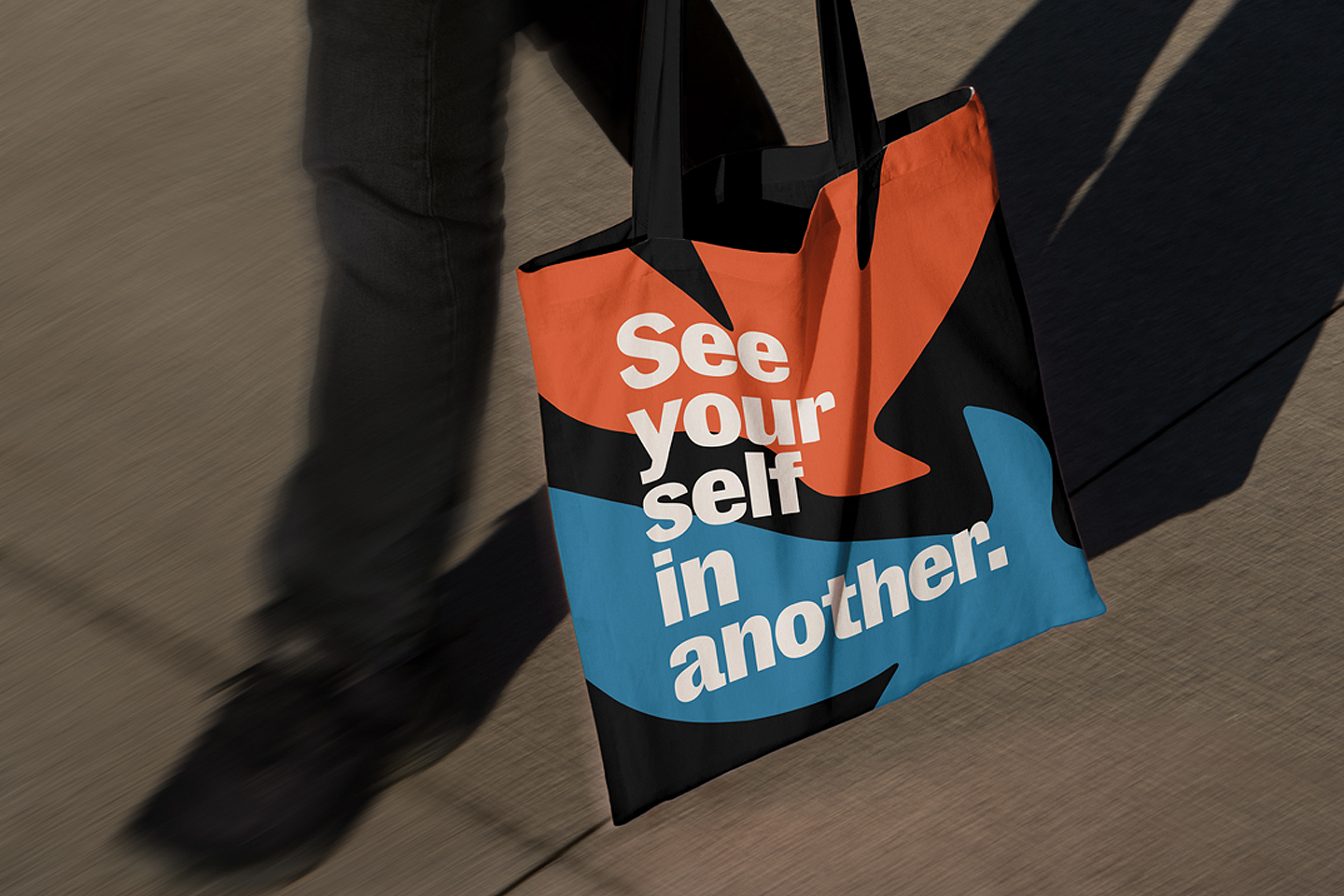
A grounded color palette and the typeface Community Gothic, with its slightly irregular, poster-like character, give the system a tactile quality. Together, the typography and color extend the identity across social content and physical products.
Brand Applications
The identity was designed to move easily between physical and digital applications. As part of the process, I helped simplify the brand message to “See yourself in another,” giving Community as Therapy a clearer, more memorable idea to communicate.
That statement becomes a recurring part of the visual language, expressed in different ways while maintaining the same direct, human voice.
Conversation Cards
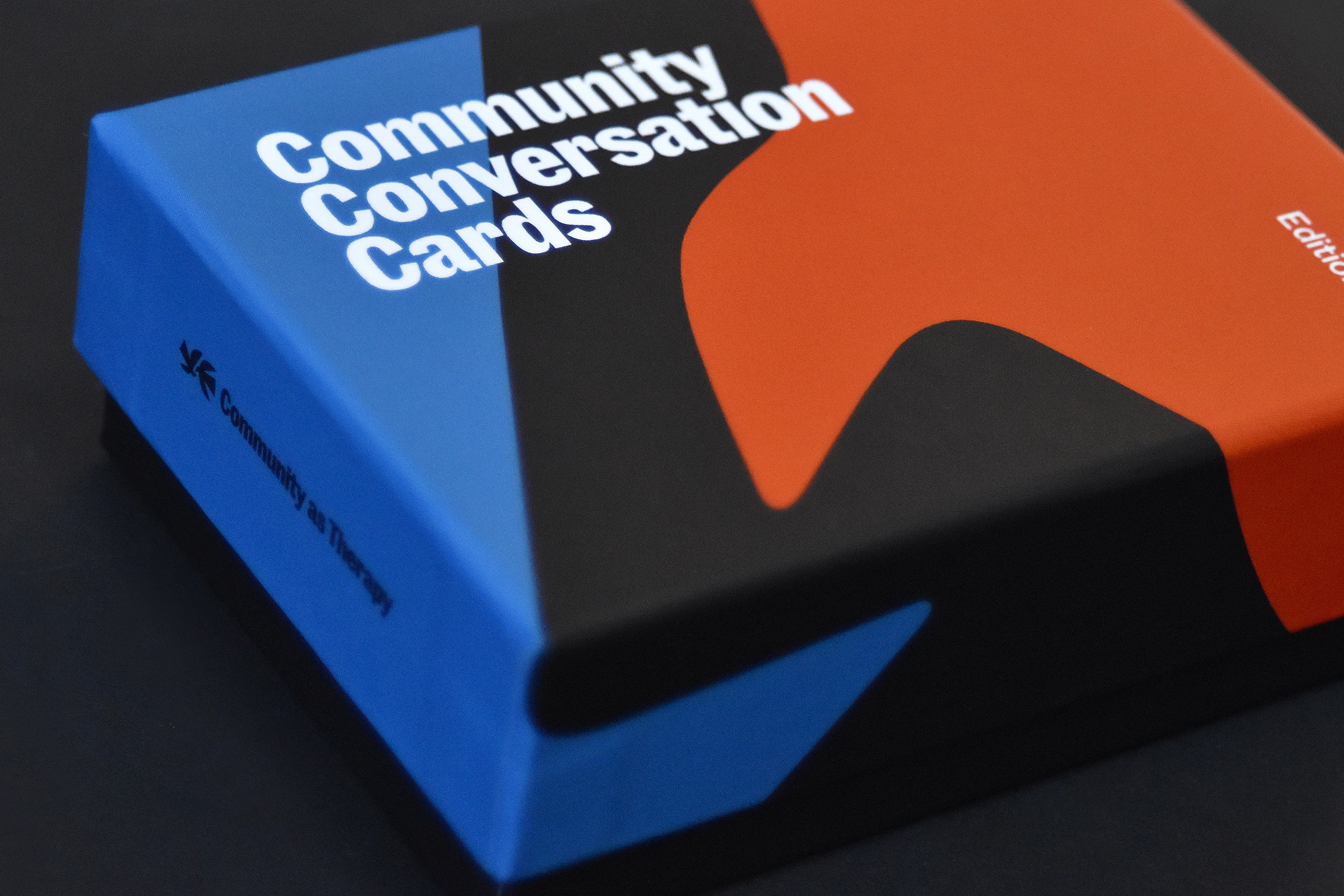
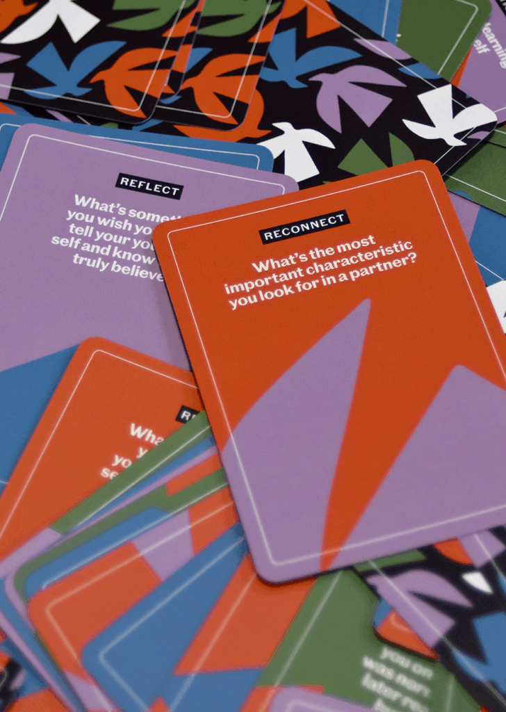
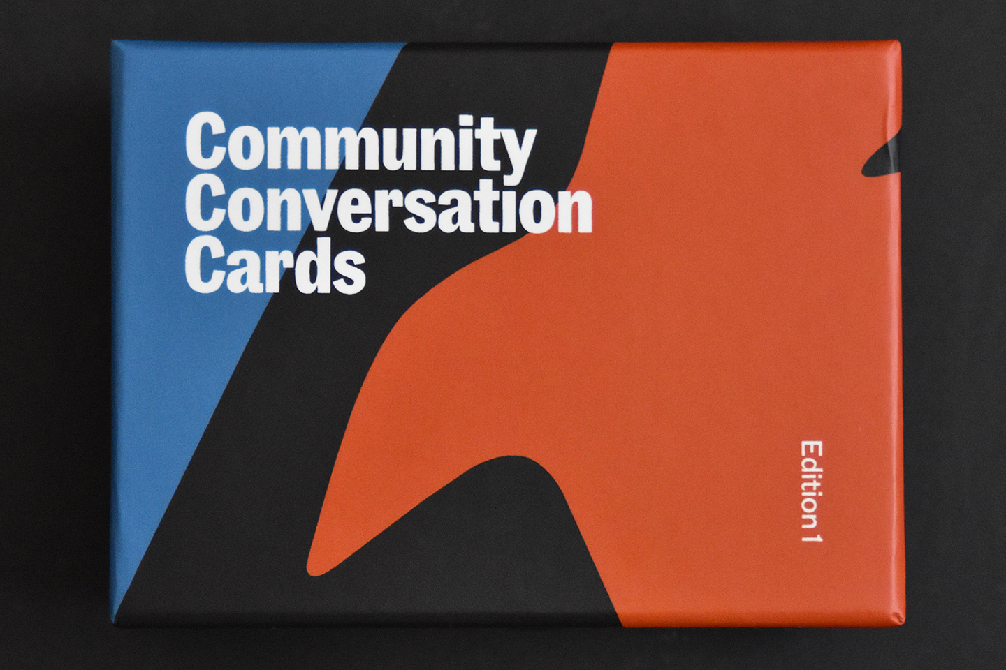
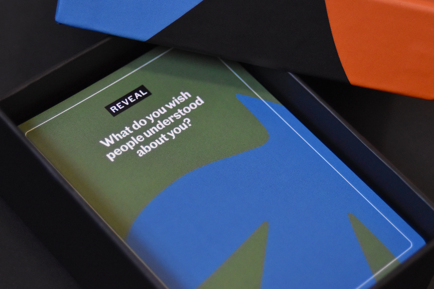
The Community Conversation Card Deck extends the identity into a physical tool designed to help people move beyond small talk and into more meaningful conversation. Organized into four categories, Notice, Reveal, Reflect, and Reconnect, the prompts gradually move from observation toward deeper reflection and connection.
I developed the packaging and card system so each category has its own character through color, shape, and typography while still feeling connected as one cohesive set.