Like the ingredients in your favorite meal, every part of a brand identity has a purpose. Each element brings its own flavor and character, but together they create something whole — something balanced, memorable, and satisfying. A strong identity doesn’t just decorate; it communicates. It helps people feel something about a company before they even read a word. When done well, design expresses what a brand values most — and why it matters.
Below are five key ingredients that make a visual identity work — and last.
Heart
Every identity needs heart. It’s the emotional core that brings warmth and humanity to a brand. That might come through color, a symbol, or even the tone of typography. Heart is what makes a mark feel alive — what helps people connect to something beyond a product or service.
When we sense care and intention behind design, it builds trust and creates belonging. Without it, even the most polished identity can feel empty.
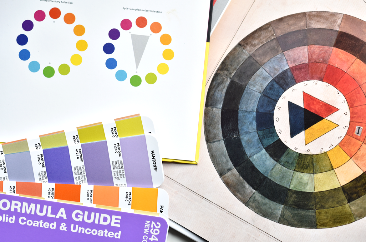
Flexibility
An effective identity system can bend without breaking. That means having variations that work across different applications — a full lockup, a wordmark, a stacked version, and a standalone symbol.
But flexibility isn’t just about the logo. It’s also about how color, pattern, and typography create a visual language that can evolve as the brand grows. When these elements work together, a brand feels consistent but never rigid — able to shift with the moment while staying unmistakably itself. You can see this kind of flexibility in the new Hoopbus brand identity.
Memorability
A memorable identity doesn’t blend in — it stands apart. It captures attention in a way that feels effortless. It’s not louder or trendier, just more sure of itself.
Something about it lingers — a shape, a rhythm, a detail you can’t quite forget. Memorability comes from clarity and confidence. When a brand expresses a true point of view, it becomes recognizable not just by how it looks, but by how it feels. It’s an idea touched on in Five Essential Questions When Designing a Logo.
Authenticity
Authenticity gives a brand identity its foundation. It’s easy to chase trends or mimic what’s popular, but meaningful design comes from honesty.
An authentic identity reflects who the company really is and speaks directly to the people it serves. It doesn’t try to impress everyone — only the right ones. When brands stay honest to their mission and values, their visuals naturally resonate. That honesty shows up in every detail — and it’s what builds real connection over time.
Delight
Delight is the finishing touch — the ingredient that makes everything come together. It’s the feeling when something just works. The proportions, the color, the spacing — it all feels balanced and intentional.
Delight invites people in. It reminds us that design can bring joy and beauty into the everyday. When an identity has delight, it doesn’t just communicate. It uplifts.
Bringing It Together
When all these ingredients are present — heart, flexibility, memorability, authenticity, and delight — design becomes more than visual. It becomes human. Crafted with purpose and built to last.
If your organization is ready for an identity that reflects who you truly are and connects with others in meaningful ways, get in touch. I’d love to hear your story.