A response many designers have heard from unhappy clients when they’re presented with a simple design solution — “My 4-year-old could have made that!” On the one hand, there might be some truth to it, on the other, achieving simplicity in logo design is not quite as simple as you think.
In this article we’ll discuss the debated topic of simplicity in logo design in order to understand how it can help or harm your brand. You might be wondering what this title, A Logo So Simple My 4-Year-Old Can Understand It, is all about. I’ll explain.
A Common Thread
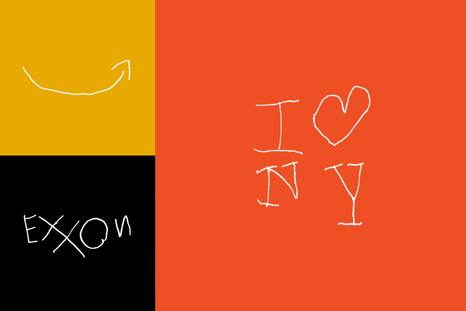
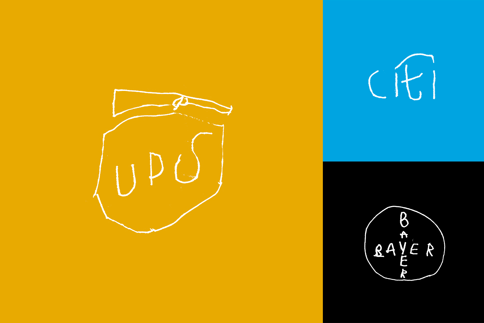
In 2018 my 4-year-old son was sitting next to me in the studio when he grabbed a pencil and paper, and began drawing a logo he saw on my computer screen. The result looked like a 4-year-old drew it, but I noticed he was able to get the basic shapes down, and even some of the details!
This experience grew into a weekly activity where we’d sit together and he would draw various iconic logos. Some were easier for him to draw than others. Some he recognized from his daily life, and others were new to him. In the end, he drew one hundred logos in one year, which I documented on Instagram.
What did we learn? This activity helped us both appreciate a common thread in many of the most iconic logos throughout history — simplicity.
Simplicity is Key
A designer takes complicated ideas and creates uncomplicated solutions that can be quickly and easily understood. This is especially important in the practice of logo design. Often times people have just a few seconds to notice and recognize your brand before they pass it by. There’s an endless amount of visual information vying for their attention, and if a logo takes too long to comprehend, potential customers are as good as gone.
To simplify is to reduce something down to the most essential parts, so it’s easier to understand. A successful logo should be easily recognized and remembered at a glance — for this, simplicity is key.
Simple is Flexible
Today logos are displayed as app icons, on social profiles, and in web browser address bars. They’re printed in one color, in full color, embroidered, and embossed. A designer must consider the range of sizes and media in which a logo will be displayed, and if it will hold up for each.
Responsive logos are designed to support these changing size requirements. In some applications the logotype may be shown along with a symbol to its left. When there’s less space, it may be stacked. In a tighter squeeze the symbol can be shown alone, and at the smallest size, there may be an even more simplified version of the symbol.
Employing simplicity in logo design can result in the creation of timeless marks that have maximum flexibility.
Simple Doesn’t Mean Boring
Mies van der Rohe said, “Less is more” to which Robert Venturi responded, “Less is a bore.” What we are not talking about here is doing less just for the sake of doing less, or designing logos that lack creativity and personality.
Some brands settle for simplistic logos that lack any distinction. Many logos today feel one and the same. They’ve become boring, predictable, and in the end, can actually harm your business because they just don’t stand out.
Yes, a logo should be simple, but should also be relevant, distinct, and memorable. It should communicate as well as delight!
So, Can a 4-Year-Old Make It?
Probably not. But, it should be simple enough for them to understand — and maybe, with shaky untrained 4-year-old hands, even redraw it!
The creation and design of simple logos that are recognizable, flexible, and distinct is harder than it looks. If your business needs a simple, yet memorable logo and you’d like to team up, let’s work together.