Artform Rebranding +
Style Guide
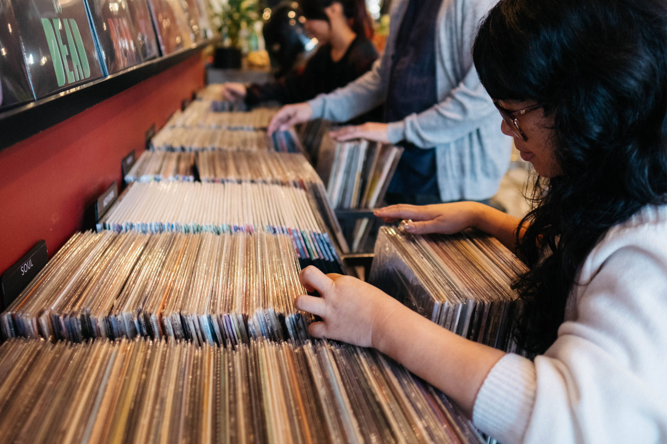
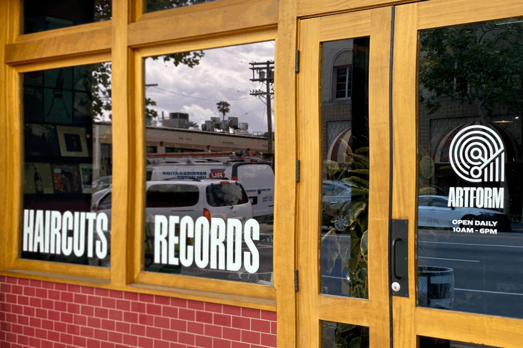
Artform is a hair salon and record store inspiring and empowering artistic self-expression by blending beauty and melody. Located in the historic Los Angeles neighborhood, Highland Park, Artform is the only destination to experience this unique synthesis of hair and music.
Having been in business for 17 years, they recognized their branding was lacking clarity and depth. Artform partnered with Ben Loiz Studio to help define their brand strategy, redesign the logo, and develop a robust visual identity system to reflect the heart and soul of the company.
Logo + Identity Design
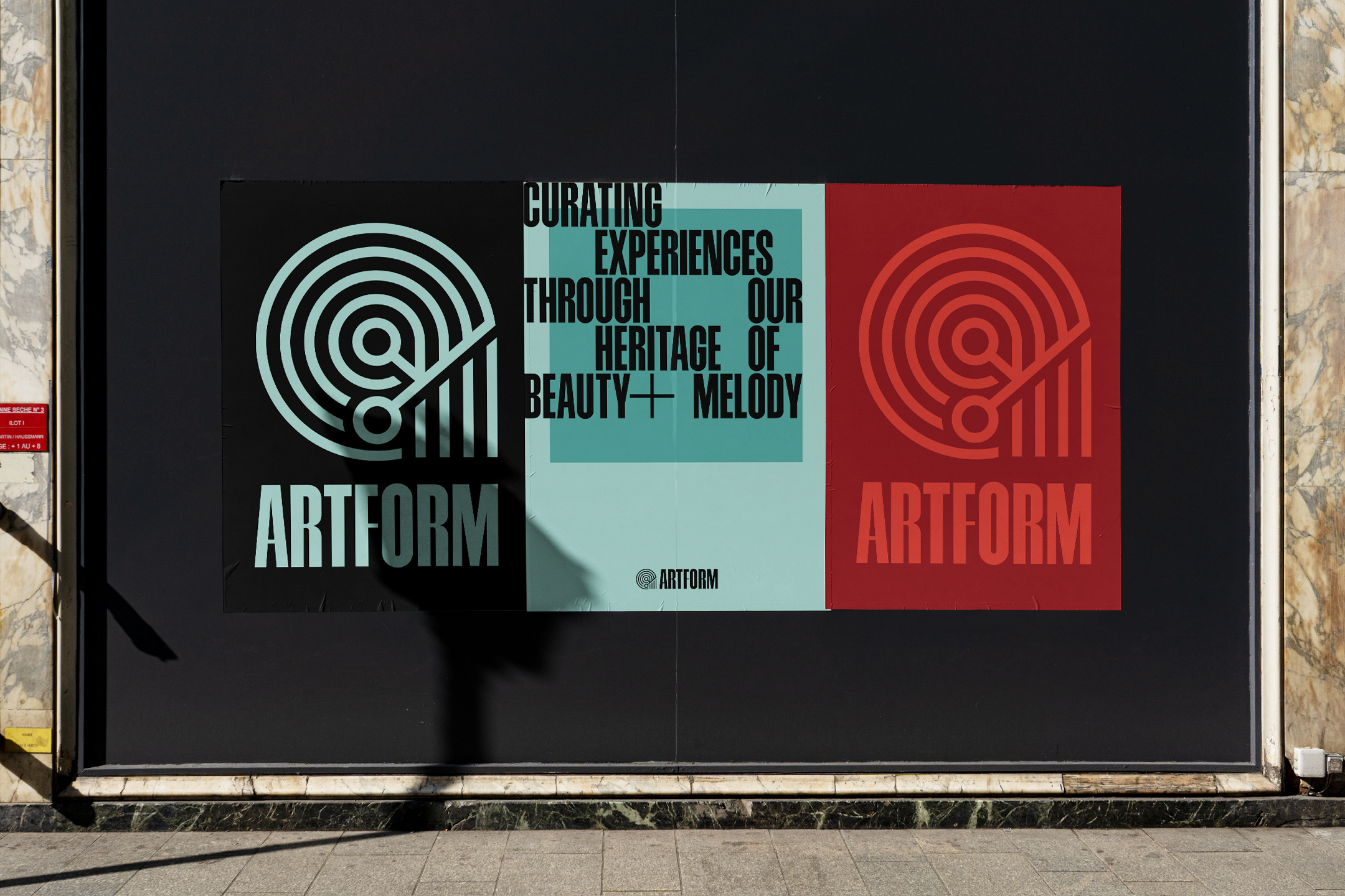
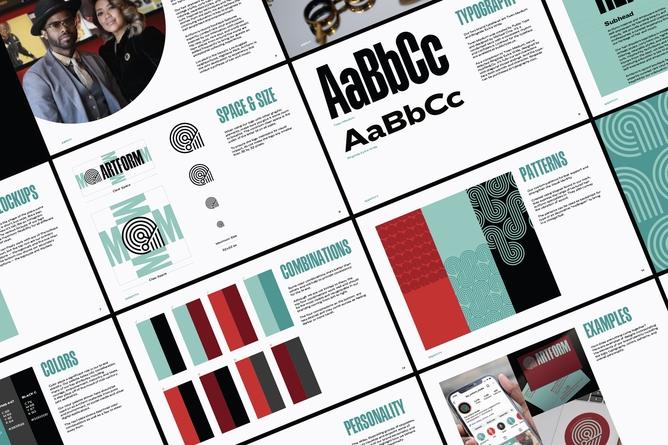
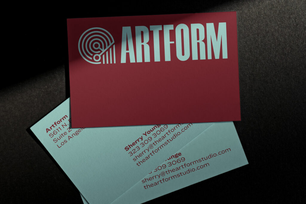
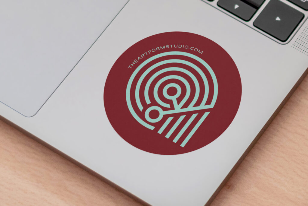
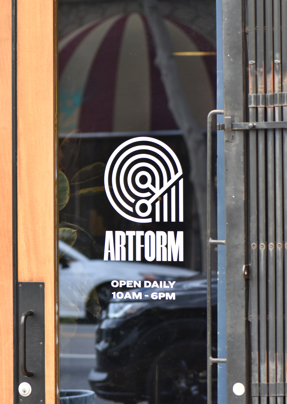
The logo was conceived and crafted with a high level of meaning and detail. We felt to retain the elements in their previous mark which include the letter ‘a,’ scissors, hair, and a vinyl record — all reflecting Artform’s purpose and services. The new mark is simplified, optically corrected, and made scaleable for the digital age. It’s solid as a rock, and can be displayed the size of a billboard or icon without losing its integrity.
The logotype was customized using visual cue’s from the mark. Cross bars in the A, R’s, and F were made thinner and centered to align with and echo the line weight of the mark.
We selected two typefaces for the brand — Twen Medium and Ringside Extra Wide. Twen Medium was created by Public Type and designed by Michael Cina. It’s a condensed sans with a consistent rhythm and confidence. Ringside Extra Wide was designed by Hoefler&Co. It’s fully-curved characters with diagonal stroke endings, lend it warmth and character.

Colors + Brand Patterns
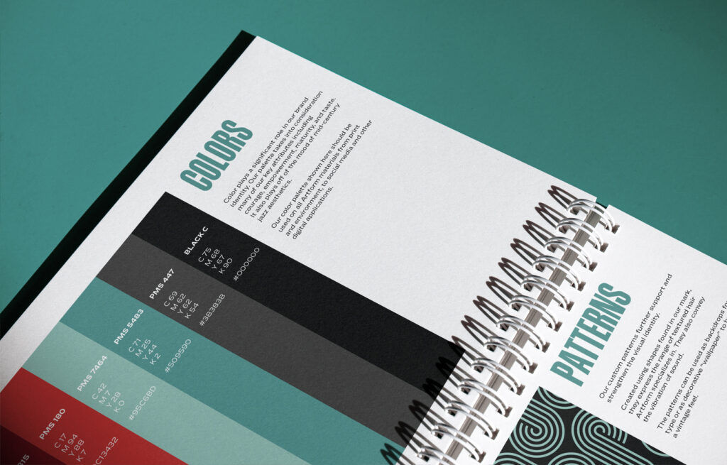
Color also plays a significant role in the new identity. The new palette expresses Artform’s key attributes including courage, empowerment, maturity, and taste. It also plays off of the mood of mid-century jazz aesthetics.
Custom patterns further support and strengthen the visual identity. Created using shapes found in the mark, they express the range of textured hair Artform specializes in. They also convey the vibration of sound.
The example here shows how the brand patterns can create an environment by being applied as wallpaper. This reinforces the visual identity while creating the mood of a vintage beauty parlor or jazz cafe.
Branding Workshop
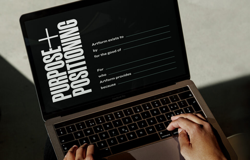
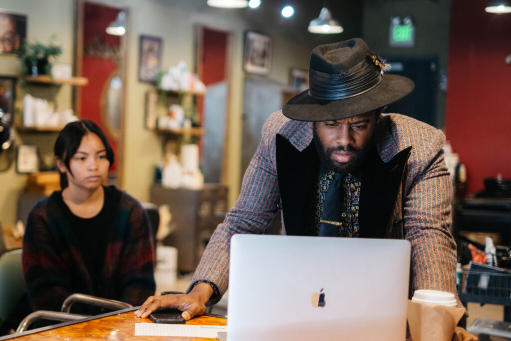
A collaborative branding workshop was conducted at Artform’s brick and mortar shop. Together, we clarified the purpose statement and positioning of the company, defined their brand archetype and personality, and developed keywords that reflect their vibes, visuals, and values.
One of the workshop exercises was a record digging session where we used our findings to discuss how the cover art or sounds reflected Artform. Through this activity, we were able to put into words nuances of the brand that would have otherwise been challenging to communicate.
Brand Identity Guide
Brand guidelines were designed to support their ongoing creative needs. The guide houses all of the discovery made during the brand workshop, along with their new visual assets.
In the long term, this guide will help them stay consistent with their verbal and visual expression. It will also assist them in producing fresh and dymnamic pieces of design communication that make the Artform brand come alive.
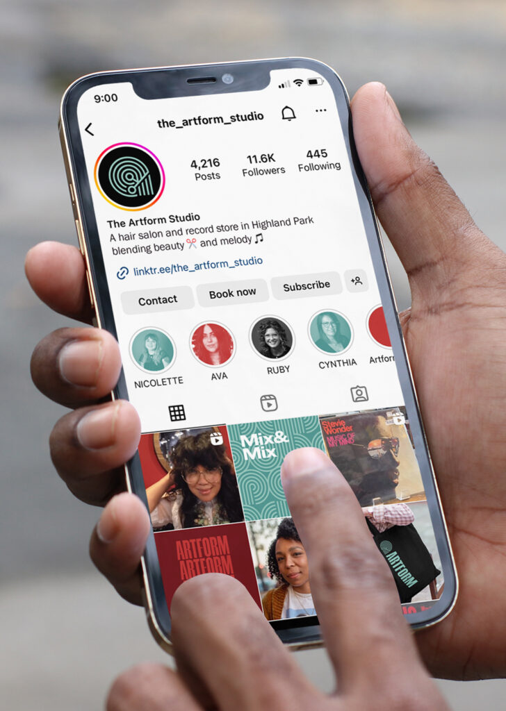
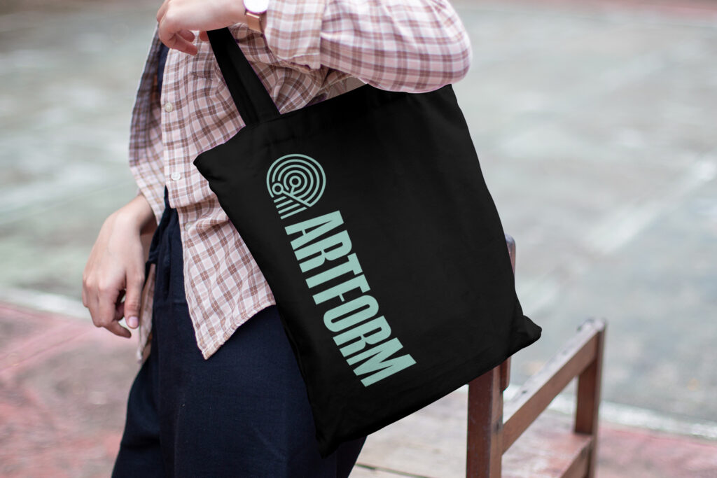
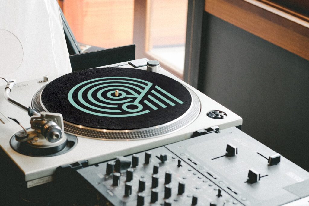
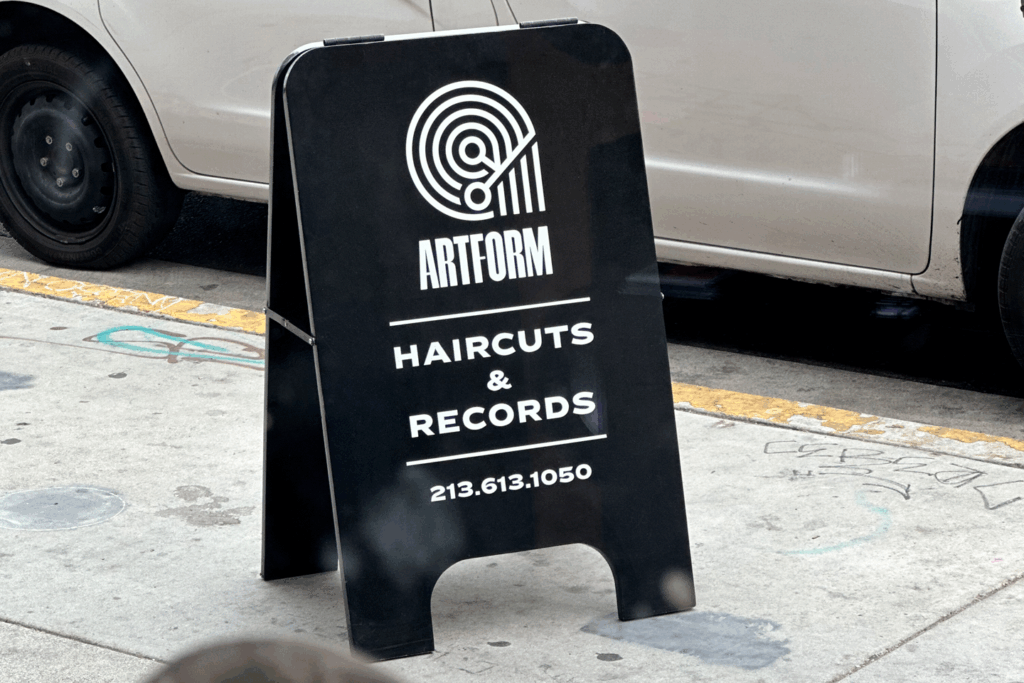
Design Applications
These examples explore how the Artform identity extends across signage, merchandise, social media, and environmental applications while maintaining a cohesive visual language.
The system was designed to reflect the intersection of music, style, culture, and community that defines the Artform experience.

Recognition + Testimonial
Artform’s new identity has been recognized with an online feature by Fonts In Use and published in the book Object Logos by Counter-Print.
Artform is now in its 17th year in business and feeling like it was time for a thorough re-brand. Ben’s branding workshop brought our vision, values, and vibes together. Our updated logo is more visible and we will be able to create motion graphics with the design. The style guide gives us a better outlook on bridging our hair salon and record store into the visuals and verbiage we needed for our re-brand.
—Sherry Younge, Artform