Chalk on fingers. The texture of a ball. The sound of shoes cutting across a floor. Grip tape under your feet. Wheels clicking over cracks in the sidewalk. These aren’t just details. They’re part of how sport is experienced, learned, and remembered.
Before sport is visual, it’s tactile. Before it’s branding, it’s movement. That’s part of why sports design has always been tricky. The game itself already carries so much meaning that branding often retreats into control: fixed logos, rigid systems, tradition protected at all costs. The result is recognizable, but rarely surprising.
I’ve always been drawn to sport not as a subject, but as a medium — a place where design can be shaped by motion, participation, and chance. Where the work doesn’t sit on top of the game, but emerges from it.
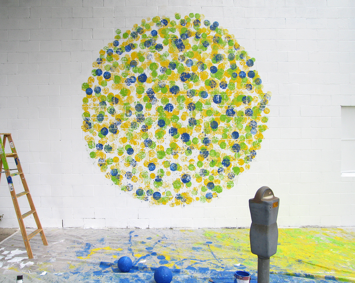
In 2006, I was asked to create a mural for Nike’s Joga Bonito campaign in advance of the World Cup. Instead of painting the wall directly, I covered soccer balls in paint using Brazil’s national colors and invited friends and family to play. They kicked and threw the balls at the wall, building the mural through movement. The final piece wasn’t just an image of the game — it was made by playing it.
That approach still defines how I think about design today.
Sport as Art
If you slow sport down, it stops reading like competition and starts feeling like movement. A crossover becomes timing. A cut becomes a line through space. In skateboarding, terrain is interpreted, not just used, as wheels trace paths, momentum shifts, and balance is constantly negotiated. What matters in those moments isn’t the score, but how movement feels and unfolds.
That’s why so many athletes talk about their craft in artistic terms. Basketball players describe improvisation, rhythm, and instinct — reading space, responding to pressure, and adjusting in real time. Style, restraint, and expression matter just as much as execution.
This way of thinking doesn’t live in theory for me. It shows up directly in how I design.
Design as Practice
When you start to see sport as movement and expression, it changes how you approach design. Branding stops being something applied to the game and becomes something shaped by it.
Court lines, arcs, sidelines, and boundaries become frameworks. They aren’t decoration — they’re systems already tested by motion, speed, and pressure.
Traditional sports identities often emphasize permanence and control. Clear marks. Fixed rules. Consistency over time. That matters. But in a sport that’s constantly in motion, rigidity can feel disconnected. Energy, color, and movement exist in real time.
My work lives in that space between structure and motion. Color systems behave relationally. Typography is treated as form first. A jersey should move with the athlete. A court should frame play, not distract from it. The goal isn’t to compete with the game visually — it’s to support it.
Design Emerging Through Play
Long before design becomes digital, it’s physical. Chalk on hands. Ink bleeding into paper. Torn edges. Spray paint hitting concrete. Imperfect marks made through repetition, pressure, and trial. That tactility matters to me because it mirrors how sport is learned — through feel first, refinement later.
Play is where those systems get tested. Not polished, not precious. Reps reveal what works. Mistakes introduce character. Texture carries memory. Just like scraped knees or scuffed courts, the evidence of use becomes part of the language.
In sport, resilience matters more than perfection — something that can be used, worn, adjusted, and still hold together. Play exposes weak ideas quickly. It also reveals unexpected possibilities.
Form Shaped by Movement
In sport, shape is never arbitrary. Courts, fields, and lanes exist to guide motion, not decorate it. I treat visual systems the same way. Shapes hold space, create rhythm, and allow motion to read clearly rather than compete for attention.
Color operates relationally. It interacts, contrasts, and vibrates the way players do on a court. It carries energy and emotion without needing to explain itself. Rather than using color to signal dominance, I’m interested in how it creates balance, clarity, and momentum. I’ve written about this in Knowing the Power & Purpose of Brand Colors.
Together, shape and color behave less like symbols and more like participants. They respond to movement, adapt under pressure, and support the game instead of overpowering it.
Design as Invitation
This approach creates a different tone. One rooted in openness rather than intimidation. Sport is competitive, but it’s also communal. It brings people together through shared movement, shared space, and shared effort.
When design leaves room for play, it invites participation. When systems are clear but flexible, people feel welcome inside them. A wordmark on a jersey, a phrase painted on a court, a color system that feels optimistic rather than aggressive — these details shape how fans experience belonging.
When sport and design align this way, the feeling carries through. Color isn’t just visual, it sets emotional temperature. Words and symbols don’t just identify teams, they signal belonging. For fans, that matters. What stays with them isn’t only the result of the game, but how it felt to be part of it.
Built to Move
Movement informs form. Play informs structure. The result isn’t louder branding, but work that feels more alive — because it’s built from the same forces that make the game compelling in the first place.
When design starts there, it stops being surface and becomes part of the game itself. It carries feeling, invites connection, and leaves room for people to see themselves inside it — athletes, fans, and communities alike.
If you’re thinking about how your sports brand shows up in the world and want an identity that’s built to move, connect, and last, let’s talk.